
Help4 Builder Tutorials
Help for the job in front of you
What would you like to do?
Choose a task, follow the illustrated steps and check the saved result. You do not need to watch the entire video library before making one text or photo change.
Search the guide libraryWatch recorded lessons
Search first, or watch a recorded walkthrough
The complete searchable guide library and narrated recordings remain below. Search by the thing you want to change, such as image, course, footer or product. Recordings use an earlier interface; use the written task checks for current behavior.
Search all guidesWatch the video library
Personalizer and engraving have their own workflow
For customer photo editing, frames, engraving and production settings, use the specialist Personalizer library. A customer preview is not a machine-ready export or proof that every manufacturing workflow is configured.
Personalizer tutorial libraryInstall and privacyCustomer photo editorProduction workflow
Not sure which payment guide to use?
Choose native payment routing for Help4 Commerce. Choose the standalone Stripe Router guide for its separate WooCommerce product. They are different configurations, not two names for the same install.
Choose a starting layout, then make it yours
Starting from a blank page? Use the templates and icons guide to choose a foundation, then follow the module controls walkthrough to change supported text, images, buttons and layout settings.
For original visual assets, the AI image prompt guide explains how to describe the subject and intended image shape. Check the actual generated result, usage rights and a useful text alternative before uploading it; an image is not a replacement for readable page copy.
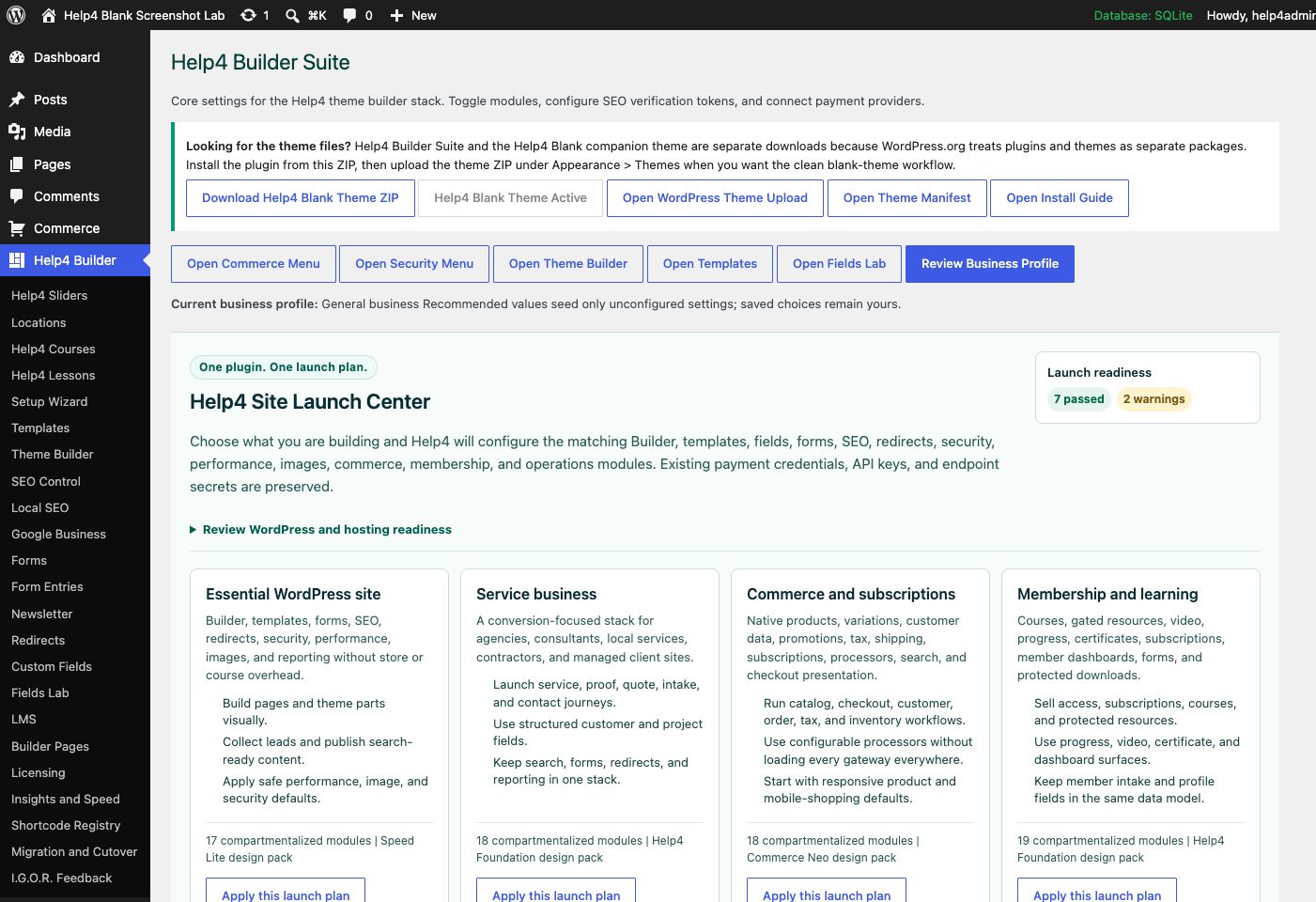
Settings and launch center
Choose a launch plan, confirm modules, download Help4 Blank, review readiness, and keep the site configuration in one place.
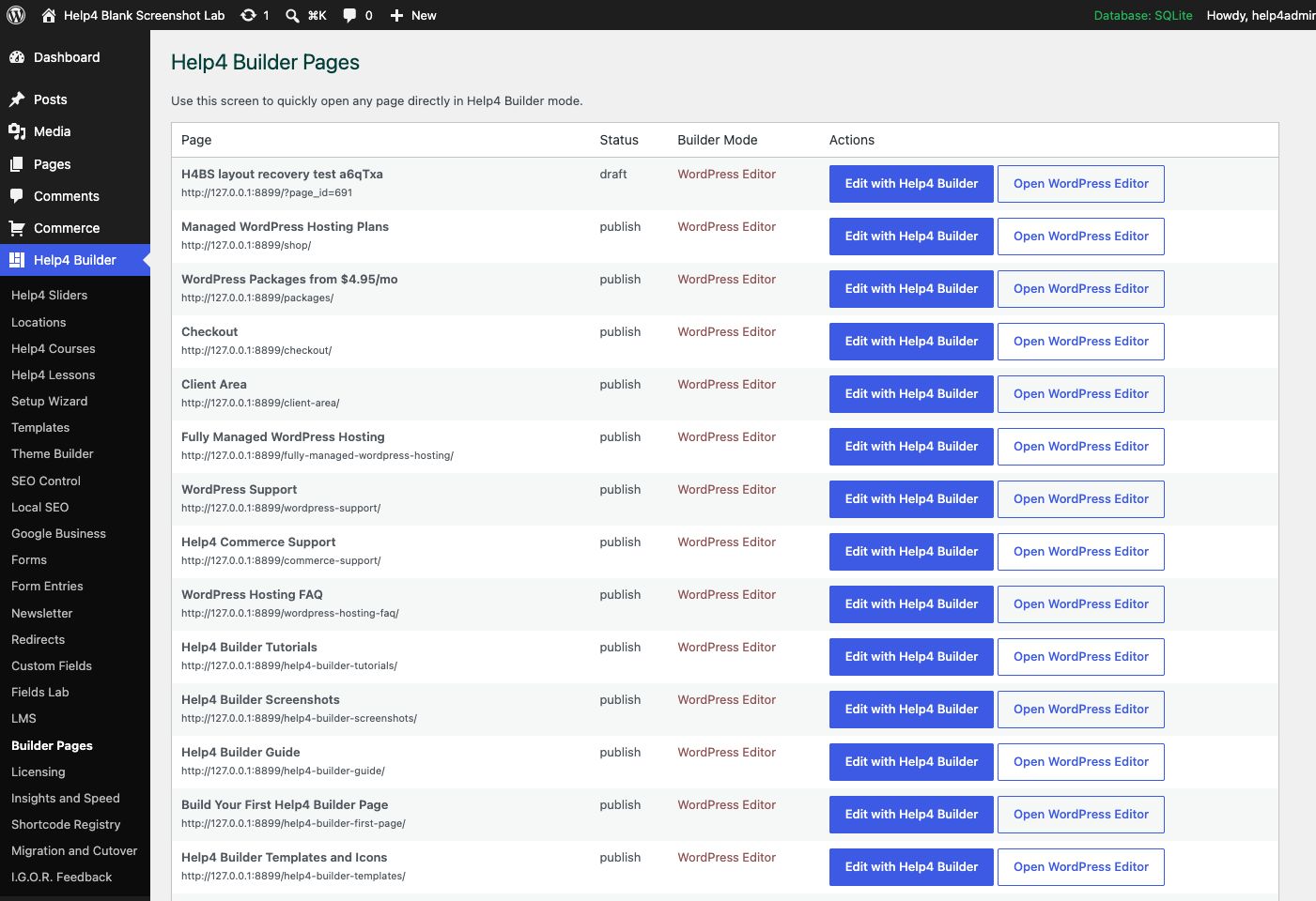
Builder Pages
Find Builder-enabled pages, open Builder Studio, and keep drafts separate from live customer pages.
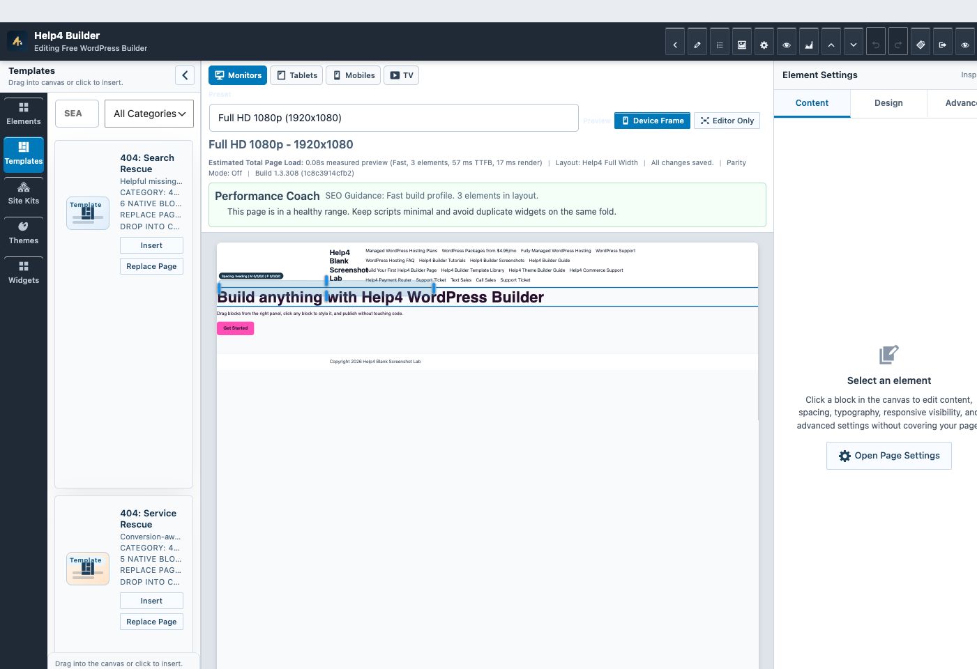
Builder Studio
Use the live page frame, element library, template library, inspector, responsive controls, performance guidance, and save state in one workspace.
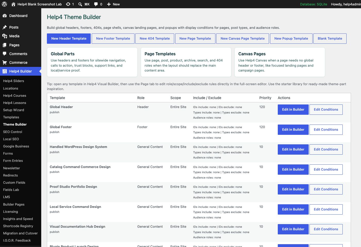
Theme Builder
Create global headers, footers, 404s, page shells, canvas landing pages, popups, and display conditions.
Watch the real workflow
Follow 49 short, narrated Builder lessons.
Each lesson uses a current, privacy-safe Builder screen, natural narration, synchronized English captions, and a complete written transcript.
Lesson 49
Click to Edit Your First Builder Change
Open the correct page, click visible text or an image, preview the unsaved result, publish, and verify without deleting neighboring content.
Read the complete transcript
- Open the Correct Page
From WordPress, open Help4 Builder, choose Builder Pages, and open the page you mean to change. Check the page title at the upper left. The page is now in Studio: tools on the left, Live Preview in the center, and the inspector on the right.
- Click and Replace an Image
To change a photo, click the photo itself in Live Preview. The inspector says Selected image. Choose Replace Image, pick the approved file, add a useful description, and change its link only when needed. On migrated pages, this quick editor protects the rest of the HTML block.
- Click and Edit the Words
To change words, click the visible heading or paragraph. Type only the new words in Selected heading text. Watch the same unsaved result stay visible in Live Preview, then check tablet and mobile. If the old value returns, stop and do not publish.
- Publish and Verify
When the preview is correct, choose Save Element and Publish. Open the public page in another tab and confirm the new words or image, every link, and the neighboring content. Use Navigator only when overlapping layers make the exact item difficult to click.
Lesson 1
Find and Open Help4 Builder
Open the correct page, recognize the Studio workspace, select nested elements, and find page recovery controls.
Read the complete transcript
- Open Builder Pages
Start in WordPress and choose Help4 Builder, then Builder Pages. Find the page you want and open it in Studio. This avoids editing the wrong WordPress object or template.
- Recognize Studio
Studio has three working areas. Elements and templates are on the left, your live page is in the center, and the selected element settings appear on the right.
- Use Navigator
When a page is busy, open Navigator. Select the exact section, heading, button, or image by name instead of trying to click through overlapping content.
- Know Your Recovery Controls
Before a larger change, open Page Settings and confirm the page mode and history controls. You now know where to recover without rebuilding the page.
Lesson 2
Edit Text and Responsive Style
Change heading content, typography, spacing, and mobile values while keeping semantic structure intact.
Read the complete transcript
- Edit the Words
Select the heading and begin in Content. Replace only the words you need. Keep one meaningful H1 for the page, and use H2 or H3 for sections underneath it.
- Open Design
Move to Design for font family, weight, size, line height, color, spacing, and alignment. These controls change appearance without replacing the content.
- Set Mobile Values
Choose the Mobile device context before changing small-screen size or spacing. A mobile value can differ from desktop while the original desktop value stays intact.
- Review Then Save
Look at the center preview after each meaningful change. Check desktop, tablet, and mobile, then save only when the text and spacing look correct in every view.
Lesson 3
Replace an Image Safely
Replace image media, write useful alternative text, and verify responsive fit without deleting the surrounding layout.
Read the complete transcript
- Select Only the Image
Use Navigator to select the image element itself. Do not remove the parent section or an HTML block when your goal is only to replace one picture.
- Choose the New Media
In Content, choose the media item or enter the approved image URL. Keep the existing element ID so surrounding styles, links, and responsive rules remain attached.
- Describe the Image
Add concise alternative text that explains the image's purpose. Decorative images can use empty alt text, but informative images need a useful description for visitors using assistive technology.
- Check Every View
Switch through desktop, tablet, and mobile. Confirm the image does not crop important content, stretch, disappear, or force the page wider than the screen before saving.
Lesson 4
Page Settings, History, and Recovery
Use page-level settings, responsive preview, revision history, and recovery controls before publishing a larger change.
Read the complete transcript
- Open Page Settings
Open Page Settings from the Studio toolbar. This area controls the page-level Builder mode, layout behavior, and recovery tools rather than one individual element.
- Confirm the Right Page
Read the page title at the top of Studio before making changes. On sites with templates and similarly named pages, this simple check prevents expensive mistakes.
- Use History Deliberately
Use the available history or recovery entry when a recent edit caused a problem. Restore the smallest known-good state, then verify the page instead of repeatedly changing unrelated controls.
- Preview Before Publishing
Review the live preview at desktop, tablet, and mobile. Publish only after content, links, spacing, and important interactions still behave as expected.
Lesson 5
A Safe Builder Editing Workflow
Make one controlled change at a time, inspect the correct element, verify responsive output, and recover cleanly if needed.
Read the complete transcript
- Select by Name
Begin with Navigator and select the element by name. This is safer than deleting a row or replacing raw HTML when you only need to change text, a link, or an image.
- Change One Thing
Change one logical item at a time. After editing content, pause and inspect the preview. Small steps make it clear which change caused a visual problem.
- Check Responsive Design
Review desktop, tablet, and mobile contexts before saving. Watch for clipped text, unexpected wrapping, missing media, and controls that become too small to use.
- Recover, Do Not Rebuild
If the page goes wrong, stop editing and use Page Settings or history. Recover the last good state first, then retry the intended change with the correct element selected.
Lesson 6
Build and Style Buttons
Read the complete transcript
- Set Label and Link
Select the Button element and begin in Content. Write a specific action label, enter the correct destination, and choose new-tab behavior only when it helps the visitor.
- Style the Normal State
In Design, set typography, text and background colors, border, radius, and padding. Keep the button easy to recognize and large enough to tap.
- Check Interaction States
Switch between normal and hover settings. Use a visible state change while preserving readable contrast. Keyboard focus must remain obvious instead of disappearing into the page.
- Tune Each Device
Use device-specific controls for mobile padding, alignment, or width. Confirm the label stays inside the button and the button does not push the page sideways.
Lesson 7
Sections, Containers, and Columns
Understand the layout hierarchy, choose grid or flex behavior, and set responsive gaps, widths, and stacking.
Read the complete transcript
- Read the Hierarchy
Navigator shows the page hierarchy. A section contains columns or inner containers, and those containers hold headings, images, buttons, and other content elements.
- Choose the Layout
Select the parent section and open Design. Choose grid or flex behavior, then set column structure, alignment, wrapping, content width, and overflow intentionally.
- Control Space
Use gap for space between children and padding for space inside the parent. Avoid stacking large margins and padding until the layout becomes unpredictable.
- Set Responsive Structure
On tablet and mobile, change columns, stacking, gap, width, and alignment as needed. The mobile layout should read in a logical order without custom CSS.
Lesson 8
Headers, Menus, and Mobile Navigation
Read the complete transcript
- Create a Header Template
Open Theme Builder and create or edit a header template. Reusable headers belong here so one controlled update can reach the assigned parts of the site.
- Insert the Menu Widget
In Studio, search the widget library for Menu. Insert the native component, then select the WordPress menu you want visitors to use.
- Configure Navigation
Set desktop orientation, dropdown behavior, submenu spacing, mobile breakpoint, and the compact menu trigger. Check that pointer and keyboard users can reach every submenu item.
- Assign and Test
Save the template conditions, then test a normal page on desktop and mobile. The mobile trigger should be visible, named, and able to open and close the complete menu.
Lesson 9
Forms, Lead Delivery, and Spam Protection
Create a form, add it to a page, configure delivery and consent, and test the full submission path.
Read the complete transcript
- Create the Form
Open Help4 Forms and create the form record first. Give it a clear internal name so editors can choose the correct form later without guessing.
- Place It on the Page
In Studio, insert the Form widget and select the saved form. Keep labels visible, mark required fields accurately, and use fields that match the actual follow-up workflow.
- Configure Delivery
Set the recipient, reply behavior, confirmation message, consent text, retention, and spam controls. Do not assume a form works merely because it looks correct.
- Submit a Real Test
Publish to the approved test page and submit from desktop and mobile. Confirm validation, success messaging, stored submission, notification delivery, and the reply path end to end.
Lesson 10
Templates, Site Kits, and Safe Imports
Choose reusable templates or style packs, understand import modes, and protect existing page content during application.
Read the complete transcript
- Browse Templates
Open Templates in Studio to browse reusable sections and page structures. Preview the purpose and responsive shape before inserting anything into the current page.
- Review Site Kits
Site Kits coordinate colors, typography, buttons, spacing, and related templates. Choose a kit that matches the site's purpose, not only its thumbnail.
- Choose the Right Mode
Use style-only application when existing content and block IDs must remain. Use a starter-layout replacement only when you intentionally want to replace the current structure.
- Verify the Result
After applying a template or kit, check content, links, global styles, desktop, tablet, and mobile. Use history immediately if the selected mode changed more than intended.
Lesson 11
SEO, Social Sharing, and Readability
Read the complete transcript
- Open SEO Control
Open SEO Control to see sitewide indexing health and content gaps. Start with real errors such as missing titles, descriptions, canonicals, or social images.
- Write Useful Metadata
Give each important page a specific search title and description that match its visible purpose. Avoid stuffing repeated phrases that make the result harder to understand.
- Set Social and Schema
Choose a clear social image and accurate alternative text. Select schema that describes the real page, business, product, article, event, or service rather than forcing a generic type.
- Review Before Indexing
Check readability, links, canonical URL, robots settings, sitemap coverage, and structured data. Keep drafts and staging pages out of search until the content is ready.
Lesson 12
Commerce Products, Quantity, and Checkout
Create a native product, configure purchase and quantity rules, and verify the checkout and order path.
Read the complete transcript
- Open Native Products
Open Commerce, then Products. Native Catalog mode lets you create simple, service, digital, booking, variable, and subscription products without adding a separate store plugin.
- Describe the Product
Set the name, SKU, status, price, stock, description, image, tax behavior, fulfillment, and customer requirements. Use variants when options need their own price, stock, image, or SKU.
- Set Quantity Rules
Turn off customer quantity when a configured package must stay one unit per cart line. Customers can still add another separately. Use the order-limit option only when the whole order may contain one.
- Test the Full Order
Run a test from product display through cart, payment routing, confirmation, inventory, customer record, and order status. Verify both normal quantity products and fixed one-per-line products.
Lesson 13
Global Styles and Theme Packs
Set reusable color, typography, spacing, and component styles while protecting the page structure already in place.
Read the complete transcript
- Open the Theme Library
Open Themes in Builder Studio to review style packs. A style pack coordinates semantic colors, typography, buttons, forms, and spacing. Preview its purpose before applying it, because one global choice can affect every Builder page that inherits the token.
- Use Style-Only Mode
Choose Apply Style when you want the design system without replacing the current page blocks. Use Style plus Starter only for an intentional new structure. On an existing site, style-only mode is the safer starting point because content and element IDs remain in place.
- Check an Inherited Element
Select a heading, button, or form control after applying global styles. Confirm the element is inheriting the intended token instead of carrying an old literal value. Resetting an override should return to the semantic token, not introduce another unrelated color or font.
- Verify Every Device
Review desktop, tablet, and mobile before saving global changes. Typography and spacing may inherit globally while responsive values remain device-specific. Check contrast, wrapping, tap size, and page width on several important templates, then save the global revision once.
Lesson 14
Theme Builder Conditions and Reuse
Create reusable site templates and assign them to the correct content without duplicate headers, footers, or archive output.
Read the complete transcript
- Choose the Template Role
Open Theme Builder and choose the job first: header, footer, page shell, post, archive, search, 404, popup, or canvas page. Giving the template one clear role keeps the same layout from appearing twice or being inserted once for every archive result.
- Build Reusable Structure
Open the template in Studio and insert only the reusable structure that belongs to its role. Keep page-specific copy in the page layout or dynamic fields. A global header or footer should not quietly contain content meant for one campaign or one customer.
- Set Narrow Conditions
Set scope, content type, includes, excludes, and priority as narrowly as the job requires. Start with a draft assignment, confirm a representative route, and avoid competing templates with the same priority. Specific exclusions should win when a checkout or canvas page needs a different shell.
- Test Assigned Routes
Check Studio and public output on a normal page, a matching singular item, an archive, search, 404, and mobile navigation where relevant. Confirm exactly one assigned template renders, required assets load, interactive controls work, and an unrelated route remains unchanged.
Lesson 15
Custom Fields and Dynamic Data
Model reusable content with typed fields, then bind approved post, taxonomy, user, product, and relationship values safely.
Read the complete transcript
- Model the Content
Open Fields Lab before building the template. Create stable field names and choose the correct types for text, images, choices, repeaters, groups, relationships, maps, and private values. Use conditional logic only when it makes the editing form easier to understand.
- Choose an Approved Source
In the Widget library, search for dynamic. Choose the source that owns the value, such as the current post, taxonomy term, author, site, product, variant, or approved post metadata. Add a sensible fallback so a missing optional value does not break the layout.
- Place Dynamic Output
Insert the dynamic widget or shortcode into a reusable template, then bind only the property needed for that element. Use the proper output format for text, links, images, lists, currency, dates, or structured content rather than forcing raw HTML into every page.
- Test More Than One Record
Preview the template with several real records, including one with a missing optional field and one with a longer value. Verify escaping, links, image alternatives, repeaters, mobile wrapping, and private-field rules. A template is not proven by the easiest record alone.
Lesson 16
Sliders, Motion, and Video Fallbacks
Configure accessible sliders and video with responsive sizing, reduced motion, HLS primary playback, and dependable fallbacks.
Read the complete transcript
- Configure the Slider Source
Select the Slider element and choose saved slides or approved dynamic content. Set a deliberate order, limit, image fit, and responsive height. Keep keyboard, swipe, arrows, dots, and a pause control available whenever the slider advances or changes content automatically.
- Use Motion with Restraint
Choose the transition, duration, delay, easing, and optional image motion for a clear purpose. Avoid rapid autoplay or movement that hides information before it can be read. Reduced-motion visitors should receive a stable version without losing the slide content or controls.
- Build the Video Fallback Chain
For video, set HLS as the primary stream when available, then provide a compatible MP4, WebM, or media-library fallback. Add a poster and a separate failure image. Configure controls, preload, fit, title, mute, loop, and autoplay according to the video's actual role.
- Verify Playback and Layout
Test desktop, tablet, and mobile with normal and reduced motion. Check HLS support, file fallback, blocked autoplay, poster loading, failure image, captions where speech matters, keyboard controls, focal framing, and page containment. A working administrator preview is not the final playback test.
Lesson 17
SEO Scores, Readability, and Schema
Use page-specific search, readability, social, and structured-data checks to improve useful content without chasing a cosmetic score.
Read the complete transcript
- Start with the Health Report
Open SEO Control and review the page-specific findings. Prioritize missing titles, descriptions, canonicals, social images, indexability mistakes, broken sitemap routes, and absent structured data. A high score is useful only when the visible page also answers the visitor's real question.
- Align Metadata and Content
Write one clear page heading, a specific search title, and a useful description that describe the same purpose. Review paragraph length, headings, links, and reading difficulty for the intended audience. Do not repeat a phrase until the copy becomes awkward or less informative.
- Set Social and Schema Details
Choose a relevant 1200 by 630 social image or an approved sitewide fallback, and verify its alternative text where the image is visible. Select schema that matches the real page entity, then complete required business, product, article, event, or service properties truthfully.
- Verify the Public Source
Open the public URL and confirm one title, one canonical, robots directives, Open Graph and messaging metadata, social image URLs, structured data, and sitemap status. Test an indexable page and a draft or private page so the controls prove both inclusion and exclusion behavior.
Lesson 18
Local, International SEO, and IndexNow
Configure truthful business entities, locations, languages, social profiles, sitemaps, and change notifications for wider discovery.
Read the complete transcript
- Define the Real Business
Open Local SEO and enter the public business name, phone, website, category, hours, address or truthful service area, and social profiles. Do not create a location for an address that does not serve customers. Visible contact content and structured data should describe the same entity.
- Plan Locations and Languages
Create a location page only when it provides distinct, accurate help for that market. For multilingual sites, use the real language and regional URLs, translated content, canonicals, and alternate-language relationships. Avoid copying a city name into many otherwise identical doorway pages.
- Review Discovery Settings
Check sitemap coverage, robots rules, canonical URLs, Bing and Google verification fields, and social profiles. Enable IndexNow only on the production site with a valid key endpoint. Queue changed or deleted URLs rather than resubmitting the entire site after every small edit.
- Confirm the Public Signals
Verify the business facts in visible content, local schema, maps, contact links, social previews, sitemap pages, and external profiles. Review IndexNow response history and retries without treating submission as guaranteed indexing. Search engines still decide whether and when a page appears.
Lesson 19
Commerce Variations, Subscriptions, and Customer Fields
Configure product options, recurring terms, quantity behavior, and reusable customer data across checkout and account workflows.
Read the complete transcript
- Choose the Product Model
Open the product editor and choose the type that matches the offer: simple, service, digital, booking, variable, or subscription. Add variants only when an option needs its own price, stock, SKU, image, fulfillment, tax, or availability instead of hiding those differences in description text.
- Set Quantity and Recurring Rules
Decide whether the customer may change quantity, whether one configured package must stay one unit per cart line, and whether the entire order is limited to one. For subscriptions, state the interval, trial, setup amount, renewal behavior, and cancellation path before testing payment.
- Define Customer Fields Once
Use Customer Fields for information needed across checkout, accounts, orders, support, exports, and privacy tools. Choose the correct field type, placement, requirement, validation, conditional logic, and visibility. Never collect sensitive information merely because a text field makes it possible.
- Test Different Product Paths
Run simple, variable, subscription, and fixed-quantity examples through catalog, cart, checkout, payment, confirmation, customer account, inventory, email, refund, and renewal states. Confirm customer fields persist only where intended and a fixed one-per-line item never exposes a quantity control.
Lesson 20
Checkout, Payment Routing, and Orders
Connect payment processors, validate routing and totals, and test the complete order lifecycle before accepting a live payment.
Read the complete transcript
- Configure Gateways Safely
Open Gateways and configure only the processors the store will use. Keep test and live credentials separate, choose supported currencies, and verify webhook destinations. Never place secret keys in screenshots, page content, Builder settings, support messages, or browser-visible source.
- Set Routing Rules
Build the narrowest routing rule for product, currency, country, subscription, or other supported context, then define a safe default. Review rule priority so one order cannot match several conflicting accounts. A route should explain why the selected processor received that checkout.
- Verify Cart and Totals
Test product selection, variations, quantity behavior, promotions, shipping, tax, and customer fields before payment begins. Compare the displayed subtotal, discount, shipping, tax, and total with the order record. Failed payment initialization should not create a false completed order or consume inventory.
- Complete the Order Matrix
Use approved test transactions for success, decline, retry, webhook delay, duplicate event, cancellation, refund, subscription renewal, and mobile checkout. Confirm order status, inventory, customer history, email notices, payment references, and idempotency remain correct after refresh or repeated callbacks.
Lesson 21
Newsletter Subscribers and Campaign Readiness
Read the complete transcript
- Build the Signup Form
Create a short newsletter form with a visible email label, clear purpose, required consent where applicable, an honest confirmation message, spam protection, and the correct privacy link. Keep personal newsletter signups separate from business prospect records and unrelated contact forms.
- Review Subscriber Status
Open Newsletter to review subscriber email, name, tags, and status. Add a person manually only when the source and permission are known. Preserve pending, confirmed, unsubscribed, bounced, complained, and suppressed states so a later import or export cannot quietly reactivate them.
- Prepare Sender and Audience Data
Before sending, verify the From name, reply address, postal address, authentication records, privacy URL, unsubscribe path, and audience segment outside the page design. Use tags that describe a real signup source or interest, and do not invent engagement or consent history.
- Test the Handoff
Submit a real test signup, confirm validation and storage, exercise confirmation and unsubscribe paths, and inspect fresh logs. If an external or later campaign module receives the audience, verify suppression, personalization, mobile email layout, reply handling, delivery, open measurement, and click measurement before scheduling.
Lesson 22
Images, Cache, Assets, and Performance
Optimize media and module loading, measure cold and warm requests, and improve speed without breaking interactive behavior.
Read the complete transcript
- Prepare the Media
Open Image Studio and inspect the original before generating a derivative. Choose dimensions, crop, quality, and modern formats for the actual placement. Preserve the approved original and metadata, then confirm the responsive source set does not substitute an unrelated image.
- Read the Performance Evidence
Open Insights and review versions, module health, page estimates, REST checks, shortcodes, and recent diagnostics. Measure a cold anonymous request and a warmed request separately. A fast cached page does not prove the origin, editor, checkout, or signed-in experience is healthy.
- Reduce Unused Work
Use Performance Coach and the page structure to remove duplicate widgets, oversized media, unnecessary sliders, and modules the page does not use. Keep module CSS and scripts scoped to the surfaces that need them, while preserving preview and public asset parity.
- Retest Interactions and Bypasses
After cache or asset changes, retest menus, forms, sliders, video, search, cart, checkout, account pages, preview, and save behavior at desktop and mobile. Confirm query, cookie, private, and transactional requests bypass public cache correctly, then inspect fresh browser and PHP logs.
Lesson 23
Security, Updates, and Recovery
Harden the site in measured steps, verify release identity, and keep a tested recovery path before changing production.
Read the complete transcript
- Review Security Findings
Open Security and review HTTPS, headers, login protection, trusted proxy handling, origin access, file permissions, salts, XML-RPC, REST exposure, and commerce protections. Change one bounded control at a time so the exact setting can be reversed if authentication or public delivery fails.
- Verify the Release Identity
Open Builder settings and record the active version, immutable build hash, enabled modules, update channel, WordPress version, PHP version, database state, active theme, and companion requirements. The displayed version, manifest, ZIP hash, installed files, and asset query versions should describe one release.
- Prepare Recovery Before Updating
Keep a current database recovery point, the prior immutable plugin ZIP or directory, and any page or global layout data at risk. Confirm the recovery artifact is complete and readable before updating. A progress message or unfinished archive is not a rollback plan.
- Run Post-Update Regression
After the update, check public pages, Studio open and save, templates, mobile menus, forms, media, SEO output, commerce, cache behavior, and fresh logs. Confirm the updater reports no remaining Builder update only after the exact tested artifact and runtime behavior agree.
Lesson 24
Insights, Logs, and I.G.O.R. Diagnostics
Turn a vague Builder problem into a privacy-safe report with one reproducible action, fresh evidence, and a clear expected result.
Read the complete transcript
- Stop and Define the Failure
When an edit starts removing content, losing styles, or returning an error, stop repeated changes. Record one affected URL or admin screen, page or template ID, selected element, user role, viewport, exact action, expected result, actual result, and the time of the attempt.
- Gather Fresh Evidence
Use Insights and fresh browser or PHP logs from the same reproduction. Capture the response status, one relevant console message, active versions, enabled modules, theme, and a screenshot showing the complete control and result. Old errors from another request can send diagnosis in the wrong direction.
- Protect Private Information
Review what I.G.O.R. will send before submission. Remove passwords, nonces, license keys, payment secrets, application passwords, private messages, database content, raw customer records, and tracking details. Include only the smallest environment and reproduction evidence needed to understand the issue.
- Submit One Connected Report
Send one complete report, keep follow-up evidence on the same support record, and use History or the known recovery path when appropriate. After a fix, repeat the original action and verify Studio, public output, desktop, mobile, and fresh logs before closing the issue.
Lesson 25
Live Preview and Responsive Viewports
See draft changes in the real preview document, inspect practical device presets, and verify interactions before publishing.
Read the complete transcript
- Understand the Preview
The center of Builder Studio is an isolated preview document, not a decorative picture of the page. It loads the current draft layout with the frontend styles and scripts needed by the page. Make one change at a time and wait for the preview to settle before deciding whether the result is correct.
- Inspect a Tablet Preset
Choose Tablets, then select a useful preset. Check content order, columns, gutters, typography, buttons, media, menus, forms, and any interactive module. Device presets help expose breakpoint mistakes, but they do not replace testing on a real browser at the exact boundary widths used by the design.
- Inspect a Phone Preset
Switch to Mobiles and review the complete page at a narrow width. Look for clipped content, tiny controls, open menu panels, missing media, horizontal drift, and awkward reading order. Correct the mobile-specific value in the element or parent layout instead of shrinking the entire page.
- Save Only After Parity
Use Page Settings and the save state to confirm whether you are working with an unsaved draft or public content. Check interactive behavior in Studio, save, then open the public URL in a separate session. The layout, typography, spacing, radius, colors, and module output should agree in both places.
Lesson 26
Navigator, Layers, and Reusable Sections
Read the complete transcript
- Read the Element Tree
Open Navigator when the canvas is crowded or an element is hard to click. Read the parent, slot, and child relationships before moving anything. Select the exact heading, image, button, column, or section by name so a small content update never removes the surrounding page structure.
- Name Important Layers
Give major sections and reusable elements descriptive names. Names such as Home Hero, Pricing Grid, or Contact Button make later support and team editing much safer than a long list of generic sections. Keep stable element identifiers when replacing content so responsive values and extension data remain connected.
- Reuse the Right Structure
Use a section or page template when the same structure belongs in several places. Insert a reviewed starter, then replace its sample copy, media, links, and accessibility text. Reuse should reduce repeated work without turning every page into an identical block of unrelated content.
- Manage Shared Templates
Use Builder Templates and Theme Builder for headers, footers, page shells, archives, search, 404 pages, and other shared layouts. Confirm the role and display conditions before publishing. A shared template change can reach many routes, so test one matching and one nonmatching page before completing the update.
Lesson 27
Custom CSS, Classes, and Page-Level Styles
Use native design controls first, then add narrowly scoped page CSS with responsive and reduced-motion safeguards.
Read the complete transcript
- Use Native Controls First
Start with the element Design controls for typography, color, spacing, border, radius, alignment, and responsive values. Native settings are editable, portable, and visible to the next person. Add custom CSS only when the intended visual cannot be expressed clearly through the supported controls.
- Scope Page CSS
Open Page Settings, then Code. Use the Builder root token to scope selectors to the current page or template. The supported surface can retain media queries, pseudo-elements, keyframes, and reduced-motion rules while rejecting unsafe markup. Keep selectors narrow and avoid overriding unrelated WordPress administration or plugin screens.
- Use Classes Deliberately
Add a meaningful advanced CSS class to the exact section or element that needs the rule. Prefer a reusable component name over selectors based on element order. Do not target generated browser structure that may change when blocks are reordered, and do not paste an entire third-party theme stylesheet into one page.
- Verify and Recover
Save, reopen Studio, and verify the normalized CSS is still present. Check public output at desktop, tablet, mobile, keyboard focus, normal motion, and reduced motion. If a rule causes a regression, use the page history or remove the narrow rule rather than adding a second override that hides the first problem.
Lesson 28
Redirects and 404 Monitoring
Repair moved URLs with narrow redirects, review 404 evidence, and keep canonicals, links, and sitemaps aligned.
Read the complete transcript
- Review the Missing Path
Open Redirects and review the exact missing path, request count, referrer, and most recent occurrence. A 404 is evidence, not an automatic instruction to send every missing URL to the home page. Decide whether the content moved, was replaced, should remain gone, or is simply a bad automated request.
- Create a Narrow Rule
Use an exact path redirect for a known moved page. Choose a permanent response only when the change is intended to last, and point to the closest useful replacement. Avoid broad regular expressions until they have been tested against a list of paths, because one loose rule can capture valid pages.
- Align Search Signals
Update internal links, canonical URLs, navigation, structured data, and sitemap entries so they use the final destination directly. A redirect can preserve a moved route, but repeated chains waste time and create confusing search signals. Remove the old URL from generated discovery surfaces after the replacement is verified.
- Test Both Outcomes
Request the old path and confirm one redirect reaches the correct final page. Then request the destination directly and confirm a normal successful response. Check query behavior, loops, cache state, mobile rendering, and fresh logs. Keep a true 404 response for unknown paths that have no appropriate replacement.
Lesson 29
Site Search Setup and Result Testing
Add scoped on-site search, create a useful result experience, and test empty, keyboard, and mobile states.
Read the complete transcript
- Insert Advanced Search
Open Widgets and search for Advanced Search. Insert the native widget where visitors expect it, then choose whether it searches pages, posts, products, or all supported content. Write a short placeholder that describes the scope instead of using a vague label that promises results the site cannot provide.
- Build the Result Template
Use Theme Builder to create or assign a search-results template. Include the query, result count, useful titles, excerpts, content types, and a clear no-results state. Keep one page heading and preserve the visitor query so the result page explains what was searched.
- Test Real Queries
Test an exact title, a partial phrase, different capitalization, a product term, a common misspelling, and a query with no result. Confirm excluded, draft, private, and protected content stays out. Search should return useful destinations rather than exposing internal records or unrelated system content.
- Check Keyboard and Mobile
At a narrow viewport, verify the field, submit control, filters, and result cards fit without horizontal scrolling. Use only the keyboard to reach search, submit, move through results, and return to the field. Focus must stay visible and an empty result must offer a useful next action.
Lesson 30
Mega Menus and Complex Navigation
Read the complete transcript
- Build Native Hierarchy
Begin in WordPress Menus and arrange parent and child destinations in a logical hierarchy. Enable the Help4 mega-menu container only on the parent that needs grouped content, then choose an appropriate column count and optional badge. The underlying links should remain understandable even without the expanded visual treatment.
- Place the Menu in a Header
Edit the global header template and insert the native menu component. Select the saved menu, set desktop alignment, dropdown placement, spacing, and the responsive breakpoint. Keep the logo, primary actions, and menu inside a structure that can shrink without clipping the last item.
- Test Pointer and Keyboard
On a desktop or tablet-width layout, move from the parent trigger into the submenu and confirm it remains open across the pointer path. Then use Tab, Enter, Space, and Escape. Every submenu link must be reachable, focus must remain visible, and leaving the menu should close it predictably.
- Test the Mobile Trigger
At the mobile breakpoint, verify one clearly named menu button opens and closes the complete hierarchy. The control should be large enough to tap, report its expanded state, trap no keyboard focus, and restore the page when closed. Long labels and nested items must wrap inside the viewport.
Lesson 31
LMS Courses, Protected Video, and Certificates
Compose learning surfaces for course discovery, member progress, protected playback, resources, and certificate verification.
Read the complete transcript
- Review the LMS Module
Open LMS and confirm the learning module and any registered course integration are active. Review courses, enrollments, progress, protected resources, and certificate behavior before building the public surface. Keep course ownership and access rules in the learning system rather than reproducing them as hidden page content.
- Insert Learning Widgets
In Studio, use the LMS course catalog, progress dashboard, protected video, certificate verifier, and approved addon modules. Place each widget in a template that matches its context. Provide an empty or signed-out state so anonymous visitors and members without progress do not see a broken blank area.
- Configure Protected Playback
For a protected lesson video, configure the approved access context, HLS source, file fallback, poster, failure image, controls, preload, fit, and accessible title. Test authorized, unauthorized, expired, and unsupported playback states. The fallback must not expose a private source to a visitor who lacks course access.
- Test the Learning Matrix
Check course, library, dashboard, progress, certificate, video, and protected document surfaces as an anonymous visitor, enrolled member, completed member, and editor. Repeat at desktop and mobile. Confirm progress updates, certificate codes, media controls, forms, links, and access messages work in Studio and public output.
Lesson 32
Website Snapshot and Portfolio Proof
Turn an approved public URL into current visual proof for portfolios, migrations, launch records, and support context.
Read the complete transcript
- Insert Website Snapshot
Open Widgets and search for Website Snapshot. Insert it into a recent-work, migration, or support layout, then enter the approved public URL. Use only a site you are allowed to present, and provide a fixed uploaded image when a live capture is inappropriate or unavailable.
- Set the Display
Choose the requested width, height, fit, refresh interval, link behavior, caption, and accessible description. A portfolio image should reveal the actual work clearly rather than hiding it behind heavy cropping or a generic substitute. Preserve the destination URL separately from the image source.
- Use a Proof Template
Choose a Website Snapshot gallery, comparison, migration audit, or support-context template when it matches the job. Replace sample destinations, captions, project facts, and calls to action. Do not imply work, results, or customer approval that the business cannot document.
- Verify Capture and Fallback
Check the snapshot at desktop and mobile, then test the linked destination, loading state, blocked capture, fallback image, caption, and refresh behavior. The page must remain contained when a source image has unusual dimensions, and a failed remote capture should never leave an empty broken frame.
Lesson 33
Theme Catalog and Companion Theme Setup
Install the clean Help4 Blank companion, understand theme and plugin boundaries, and apply a Builder design direction safely.
Read the complete transcript
- Understand the Two Packages
Help4 Builder Suite is the plugin that owns visual building, templates, styles, modules, and content tools. Help4 Blank is the separate WordPress theme package that provides a quiet standards-based shell. Keeping them separate preserves normal WordPress update and review boundaries while allowing Builder to work with other themes.
- Open the Theme Catalog
Open Appearance, then Help4 Theme Catalog. Review the compatible theme directions and the current active theme before changing anything. A catalog direction is inspiration and setup guidance, while the companion theme remains intentionally clean instead of shipping one customer site or Help4 marketing design.
- Install Without Losing Recovery
Before switching an established site, keep a database recovery point, the current theme package, and a record of menus, widgets, templates, and custom code. Install Help4 Blank, preview where supported, and activate only during an approved test window. Theme activation should not delete Builder layouts or media.
- Apply the Site Design in Builder
Return to Builder Studio and apply an appropriate style pack or site kit. Set the real site name, logo, typography, colors, buttons, forms, header, footer, and templates. Remove sample branding and verify ordinary non-Builder WordPress content still receives a readable theme layout.
Lesson 34
Migration, Import, Export, and Cutover
Move Builder layouts and settings through guarded exports, structural checks, media mapping, and a verified launch sequence.
Read the complete transcript
- Inventory Before Moving
Open the migration and cutover tools only after inventorying pages, templates, global styles, custom fields, menus, forms, media, redirects, SEO metadata, commerce data, users, and addon dependencies. Record the source and target versions. A migration is more than copying page HTML.
- Export a Guarded Bundle
Export the supported Builder bundle and keep its manifest and checksum with the recovery record. Do not place credentials, private customer records, payment secrets, or unrelated uploads in a portable design package. When a script will run through WP CLI eval-file, avoid first-statement assumptions and preserve every host and dry-run guard.
- Import Without Replacing by Accident
Choose style-only, merge, or explicit layout replacement according to the migration plan. Verify the import target and expected current hash before the first write. Preserve stable element identifiers, parent relationships, extension data, and non-pack global tokens unless replacement was approved.
- Validate Then Cut Over
Check block counts, unique identifiers, parent and slot graphs, media URLs, forms, menus, responsive layout, Studio parity, public pages, SEO output, and logs before changing traffic. After cutover, verify redirects, canonical host, sitemap, cache, SSL, checkout bypasses, and the exact rollback path while the recovery window is still open.
Lesson 35
Modules, Dependencies, and Update Diagnostics
Enable only the features a site needs, verify dependency health, and prove the identity and behavior of every update.
Read the complete transcript
- Choose Active Modules
Open Builder settings and review the feature modules. Enable the Builder, commerce, SEO, forms, learning, operations, or other compartments the site actually uses. Disabling an unused module can reduce administration noise and asset work, but never disable a module until you know which pages, shortcodes, templates, and data depend on it.
- Review Dependency State
Confirm WordPress, PHP, database, active theme, companion theme, addon contracts, and required extensions meet the release requirements. A dependency warning should identify the affected feature and a safe next action. It should not crash the whole site or replace an administrator screen with an unrelated promotion.
- Verify Update Identity
Record the installed version and immutable build hash, then compare the updater manifest, versioned ZIP, latest alias, downloaded checksum, plugin headers, readme, asset query versions, and runtime diagnostics. All of these should identify the same release before it is promoted from beta to public.
- Run the Regression Gate
After updating, open and save Builder Studio, test templates, responsive menus, forms, media, search, SEO, commerce, cache bypasses, and fresh logs. Use I.G.O.R. to report one reproducible failure with privacy-safe evidence. Keep the prior immutable package until the new release passes the real site acceptance matrix.
Lesson 36
Publish, Launch QA, and Rollback
Move from a reviewed Builder draft to public release with responsive, SEO, interaction, performance, and recovery checks.
Read the complete transcript
- Confirm the Intended Change
Before publishing, confirm the page or template title, status, mode, assignment, global-change state, and save revision. Read the change summary and resolve any conflict from another editor instead of overwriting it. A global style save and a page content save have different reach and should be reviewed separately.
- Keep a Recovery Point
Verify the recent page history and the wider site recovery artifact before a major launch. Record the current public layout hash or other known-good identity. The recovery target must be complete and readable, and the person running the launch should know the exact command or control used to restore it.
- Run Prelaunch Checks
Review one page heading, title, description, canonical, robots, social image, schema, sitemap status, links, forms, analytics intent, consent, accessibility, cold and warm performance, security headers, and mobile containment. Test important anonymous, signed-in, customer, and editor states without using a production payment or private record unnecessarily.
- Verify Public and Monitor
Publish once, purge only the affected cache, and open the public page in a clean session at desktop, tablet, and mobile. Confirm content, styles, media, menus, forms, and calls to action. Inspect fresh browser and PHP logs, then keep the rollback package until the update remains healthy after a warmed request and a second independent check.
Lesson 37
Build a Sales Homepage from a Blank Canvas
Turn one clear offer into a complete responsive homepage with proof, services, process, pricing, FAQ, and a final action.
Read the complete transcript
- Choose the Page Job
Begin with the visitor, the problem, and one primary action. A useful sales homepage normally needs an offer, proof, service or product choices, a simple process, pricing guidance, common questions, and a final contact action. Use a reviewed landing-page starter when it matches that job, or build the same open-band structure from a blank page.
- Build the Structure First
Create full-width sections for each part of the story, then add constrained containers and only the columns the content needs. Set desktop, tablet, and mobile gaps and padding at the parent level. Finish the reading order before styling individual headings or buttons, because a clear structure is easier to edit and less likely to collapse on a phone.
- Add Real Content and Proof
Replace every sample with the real offer, audience, evidence, service facts, links, images, and limitations. Keep one page heading, use meaningful section headings, and connect each action to a real next step. Do not publish invented testimonials, rankings, customer counts, guarantees, or visually similar replacement brand assets.
- Verify the Whole Journey
Read the page from the first promise through the final action at desktop, tablet, three hundred ninety pixels, and three hundred sixty pixels. Test every button, menu, form, media item, FAQ, and pricing choice. Then review title, description, social image, schema, performance, accessibility, and the public page before calling the homepage complete.
Lesson 38
Build a Five-Plan Pricing Comparison
Compare as many as five offers with semantic rows, honest distinctions, clear actions, and a deliberate narrow-screen order.
Read the complete transcript
- Start with the Decisions
List the decisions a customer actually needs to make before choosing a visual pattern. Give each plan a clear audience, price basis, included work, important limits, and one destination. Use a pricing comparison starter only after verifying it can represent every approved plan without hiding material differences in tiny text.
- Build Semantic Plan Content
Use headings, price text, real lists, buttons, and optional badges inside stable plan containers. Do not build the comparison as one pasted image or a maze of manual line breaks. Meaningful elements remain editable, searchable, accessible, and easier to reorder when a package changes.
- Set an Intentional Order
Choose the desktop grid and the tablet and mobile order deliberately. Five plans usually need a smaller grid or one-column sequence on narrow screens. Make the visual order match the document and keyboard order, keep plan names attached to their features, and avoid using CSS positioning to create a different inaccessible reading sequence.
- Test Prices and Actions
Verify every approved price, billing period, setup fee, feature allowance, exclusion, button label, and checkout or contact destination. Check wrapping at all responsive boundaries, keyboard focus, contrast on highlighted plans, and the public page. A pricing layout is not ready if one plan is clipped or a customer cannot tell what happens after clicking.
Lesson 39
Build an Accessible FAQ Accordion with Schema
Create useful question-and-answer disclosures that work by keyboard and produce accurate FAQ structured data without duplication.
Read the complete transcript
- Choose Real Questions
Collect questions people actually ask before buying, contacting, or completing the task. Keep each question focused and answer it directly in visible page content. An FAQ starter supplies structure, not facts, so replace every sample and remove questions that do not belong to this page.
- Use the Native FAQ Element
Insert the native accordion or FAQ element and enter one question and answer per item. Use controls that expose expanded state, connect each trigger to its panel, and preserve useful HTML such as links and short lists. Do not hide critical terms only inside collapsed content.
- Match Visible Content and Schema
Enable FAQ structured data only when the same questions and answers are visibly available on the page and appropriate for the content. Keep one source of truth so the schema cannot drift from the accordion. Review the page graph and avoid emitting a second FAQ block from another SEO tool.
- Test Every State
Open and close every item with pointer, touch, Enter, and Space. Confirm focus remains visible, answers fit at narrow widths, links work, and the open state does not jump the page unexpectedly. Then validate public structured data and verify the page remains useful when scripting is delayed or unavailable.
Lesson 40
Widget Library, Favorites, and Addon Modules
Find the right Builder element, keep trusted widgets close, and understand when an addon module owns its own data, assets, and controls.
Read the complete transcript
- Search by the Job
Open Widgets and search for the job you need, such as menu, form, image, product, course, search, video, or dynamic field. Read the widget name and category before inserting it. Similar-looking elements can own different content, accessibility behavior, scripts, and data contracts.
- Use Favorites and Recent Items
Favorite the small set of widgets your team uses correctly and use the Recent filter while building related sections. Favorites do not disable the rest of the catalog; they reduce hunting and help newer editors start from approved components. Remove a favorite when the team has replaced that pattern.
- Configure the Element, Not Its Parent
Select the inserted widget in Navigator or the preview, then edit its Content, Design, and Advanced settings. Use the parent section for layout and the widget for its own data and presentation. When a registered addon module supplies the element, keep its wrapper and extension settings intact through save and reload.
- Verify Assets and Empty States
Check that the widget loads only the styles and scripts it needs on the public page and inside Studio. Test normal data, no data, loading, error, signed-out, and mobile states where they apply. A widget is complete only when it survives save, reopen, responsive preview, and public rendering without a missing dependency.
Lesson 41
Repeaters, Relationships, and Dynamic Templates
Model repeating content once, connect related records, and bind approved values into reusable Builder templates safely.
Read the complete transcript
- Model the Content
Create a field group around the information people maintain, not the shape of one page. Use clear field names, instructions, types, validation, defaults, privacy settings, and location rules. A repeater fits repeated rows such as FAQs or specifications, while a relationship connects this record to another approved post, product, person, or resource.
- Enter Structured Values
Test the group on a representative content record. Add, reorder, and remove repeater rows; select valid related records; and confirm required, numeric, date, choice, URL, and media rules behave as expected. Keep private operational values out of public bindings even if they are convenient to store beside public content.
- Bind a Dynamic Widget
In the reusable template, insert the widget that matches the value and choose its approved dynamic source. Add a meaningful fallback for missing optional content. Keep formatting in the widget and source data in the field so editors can change a value without editing the template layout.
- Test the Content Matrix
Apply the template to the intended content type and test records with complete, partial, empty, long, and repeated data. Verify relationship permissions, parent and slot structure, mobile containment, and save reload behavior. A reusable template should fail gracefully rather than showing raw keys or empty decorative boxes.
Lesson 42
Commerce Catalog, Tax, Shipping, and Order Operations
Configure a native store from product rules through tax, shipping, checkout, payment, fulfillment, subscriptions, and refunds.
Read the complete transcript
- Review Store Readiness
Start on the Commerce dashboard and review catalog, customer, payment, order, fulfillment, subscription, refund, and operational health. Confirm currency, business identity, policy pages, email delivery, test mode, and required modules before accepting a real order.
- Verify Order Context
Open an order and read customer context, line items, quantities, options, discounts, tax, shipping, payment state, fulfillment, notes, and status history together. A single-sale product with quantity disabled should not expose a quantity control, while separately configured line items remain independently purchasable according to their product rules.
- Test Tax and Shipping
Configure reviewed tax behavior for the relevant jurisdiction and verify display, rounding, exemptions, and saved order evidence. Then test shipping zones, providers, service levels, package rules, fallback behavior, and address failures. Use test destinations that cover the boundaries the store actually serves.
- Run the Lifecycle
Complete a test from catalog through variation selection, customer fields, cart, discount, tax, shipping, payment, webhook, order email, account state, fulfillment, cancellation, refund, and subscription renewal where applicable. Repeat the critical path on mobile and keep the processor and checkout in test mode until every expected transition is recorded.
Lesson 43
Form Entries, Delivery, and Spam Diagnostics
Trace a form from accessible fields through validation, consent, spam checks, delivery evidence, confirmation, and privacy handling.
Read the complete transcript
- Build the Complete Form
Create only the fields needed for the visitor task and give each one a visible label, expected format, required state, helpful instruction, and useful error. Configure the monitored destination, subject, reply behavior, consent language, retention, spam controls, success message, and failure message before placing the form on a public page.
- Submit Controlled Test Cases
Complete the form at desktop and mobile with a valid submission, each required field missing, an invalid email or phone value, a long message, keyboard-only input, and a deliberate spam-control failure. The page should preserve useful values, move focus to the problem, explain the correction, and never expose configuration or private server details.
- Review Entry Evidence
Open Form Entries and match the test submission to its form, time, validation state, consent context, delivery attempt, and final status. Restrict access to people who need the records, avoid placing secrets in message fields, and follow the configured retention, export, and erasure policy.
- Diagnose Without Guessing
If the visitor saw success but no message arrived, confirm the entry exists, inspect the recorded delivery result, verify the monitored destination and site mail transport, check fresh logs, and test again with a controlled address. Report one reproducible path through I.G.O.R. instead of repeatedly submitting real customer data or disabling every spam control.
Lesson 44
Multisite Network Setup and SEO Controls
Provision useful network defaults while preserving per-site ownership, indexing choices, data isolation, and bounded operations.
Read the complete transcript
- Define Network Ownership
Decide which settings belong to the network and which remain site-specific before enabling modules across a multisite installation. A network default can recommend modules, security, update channels, or SEO foundations, but each site still needs its own brand, public status, content, business details, social profiles, and permissions.
- Provision Conservative Defaults
Enable only the compartments the network expects and use defaults that are safe when a new site has no stored configuration. Do not make a new site indexable merely because the network is public, and do not copy one customer organization, schema identity, analytics value, sender address, or commerce secret into every site.
- Configure Each Site
Visit the individual site administration and set its site name, canonical host, indexing choice, sitemap, metadata, social image, organization or person identity, local business data, forms, privacy routes, and template assignments. Confirm network controls do not overwrite a deliberate site-level choice during autosave or update.
- Test Isolation and Scale
Create representative sites with different modules and indexing states, then verify caches, scheduled jobs, database tables, uploads, REST routes, permissions, and deletion behavior stay isolated. Test network activation and per-site activation, upgrade one existing site, and confirm a failure on one site does not break administration or public output across the network.
Lesson 45
Google Business Profiles, Reviews, and Local Proof
Connect accurate business identity, locations, service areas, maps, reviews, visible proof, and local structured data.
Read the complete transcript
- Match the Real Business
Enter the real business name, phone, website, address or service area, hours, categories, support route, and social profiles exactly as the organization uses them publicly. Do not create a fake location or copy one site identity into another. Local structured data should describe visible, supportable business facts.
- Connect the Approved Profile
Use the approved domain, location, Place ID, map, and review connection without exposing private credentials in page content or screenshots. Verify the selected profile belongs to the business and location being edited. Keep API usage bounded to the data the site actually displays and refresh only on an appropriate schedule.
- Place Honest Local Proof
Add the business identity, location or service area, map, contact path, and review output where they help a visitor make a decision. Keep visible content and structured data aligned, label aggregate values accurately, and never manufacture, filter deceptively, or rewrite customer reviews as if they were verbatim.
- Verify the Local Surface
Check the page at desktop and mobile, then test the address or service-area language, click-to-call link, directions, map consent behavior, review source, profile destination, social preview, local schema, and public contact route. Repeat the check after a location, hours, or business-name change.
Lesson 46
WordPress Security Hardening and Recovery Access
Apply evidence-based hardening without locking out administrators, breaking trusted proxies, or losing the recovery path.
Read the complete transcript
- Review Current Risk
Open Security and review HTTPS, headers, login protection, proxy trust, file permissions, user roles, update state, secrets, exposed routes, commerce data, and fresh logs. A warning is a starting point for verification, not permission to turn on every control at once.
- Confirm Dependencies
Record the WordPress, PHP, database, plugin, theme, web server, cache, proxy, CDN, and authentication path before changing enforcement. Trust only known proxy headers and addresses. Test the real administrator route and public origin so a header or redirect change does not create a loop or hide the actual client address.
- Keep Recovery Available
Maintain a verified database and file recovery point, the prior immutable package, and an out-of-band way to disable the affected module if administration fails. Builder page history can recover content structure, but it does not replace a complete site backup for plugin, database, user, or server changes.
- Apply and Regression Test
Make one bounded change, then test anonymous pages, login, logout, password reset, administrator access, REST routes, forms, uploads, cache behavior, checkout, webhooks, scheduled jobs, and fresh logs. Use I.G.O.R. to record the exact failure and evidence instead of weakening broad controls without knowing which rule caused the problem.
Lesson 47
Cache, Assets, and Performance Diagnostics
Measure cold and warm behavior, reduce unused work, preserve bypass rules, and verify interactions instead of chasing one score.
Read the complete transcript
- Measure a Real Route
Choose a representative public route and record cold and warm response time, rendered content, transfer size, requests, long tasks, layout shifts, largest content, interaction behavior, and server logs. Test anonymously and use the same route and viewport for the before and after comparison.
- Reduce Unused Work
Optimize the media actually rendered, use responsive sources, preserve useful lazy loading, and enable only the Builder modules the page needs. Keep component styles and scripts tied to their widgets or module contracts rather than loading every commerce, learning, slider, form, or administration asset on every page.
- Protect Cache Boundaries
Cache public read-only pages where appropriate, but preserve bypass behavior for administration, previews, signed-in sessions, carts, checkout, account pages, forms, query-sensitive routes, webhooks, and personalized content. A fast cached response is wrong when it contains another visitor state or stale post-save output.
- Warm and Recheck Behavior
Purge only the affected route or site scope, request it cold, confirm the new content fingerprint, then request it warm and compare. Test menus, FAQ, sliders, video, forms, search, cart, responsive layout, and reduced motion. Keep the change only when public behavior and fresh logs remain correct as well as the performance evidence.
Lesson 48
Accessibility, Keyboard, Contrast, and Reduced Motion
Audit Builder pages for meaningful structure, complete keyboard operation, visible focus, sufficient contrast, and calm motion alternatives.
Read the complete transcript
- Check Structure and Names
Start with one descriptive page heading, a logical heading sequence, landmarks, real lists, useful link and button names, form labels, image alternatives, and an accurate page title. Structure should describe the content without depending on color, position, or a screenshot of text.
- Use the Entire Page by Keyboard
Move through the public page with Tab and Shift Tab, then operate menus, disclosures, sliders, forms, dialogs, media, and custom controls with their expected keys. Focus must remain visible, follow a useful order, avoid traps, and return to the invoking control after a dialog or menu closes.
- Verify Contrast and Responsive Reflow
Check text, icons, controls, focus indicators, errors, placeholders, disabled states, and text placed on images or colored panels. Zoom and inspect narrow widths without losing content or forcing horizontal document scrolling. A large desktop contrast value does not excuse faint body text or controls on another state.
- Respect Motion Preferences
Use motion only to support understanding, provide pause or manual controls where needed, and keep duration, delay, easing, and triggers editable. Under reduced motion, remove ambient movement, parallax, automatic transitions, and decorative video where practical while preserving every message and action. Test both preference states in Studio and public output.
Use the docs by job
The customer does not need module trivia. They need the next useful click.
Each guide explains what the screen is for, what to do first, what to check before publishing, and when to hand the work to Help4.
Blank install
Start with settings, Builder Pages, and Studio so the user knows what a healthy install looks like.
Theme files
Builder Suite and Help4 Blank are separate downloads because WordPress.org treats plugins and themes as separate packages. Use the install guide when the theme ZIP is missing.
Template path
Pick templates by page job, then customize copy, proof, images, forms, and calls to action.
Launch path
Use the SEO, readability, security, performance, and update checks before pushing a page live.
Complete documentation library
Choose the job you need to finish.
Search by task or narrow the library by category. Every guide remains present in the page source and includes real product screens, ordered steps, verification checks, recovery guidance, and a support handoff.
62 guides available.
Start here
Install and setup
Download the ZIP, activate Builder Suite, understand the blank-theme path, and run the first clean check.
First page
Build a page safely
Open Builder Pages, launch Studio, build structure first, check mobile, then publish or hand it to Help4.
Editor controls
Know which tab changes what
Use Content for information, Design for appearance and responsive values, and Advanced for identity, attributes, visibility, and motion.
Find a setting
Stop hunting through inspector tabs
Search Content, Design, and Advanced together, jump to the matching control, and continue editing without losing draft changes.
Quick help
Find the right guide inside Studio
Open task-based help, follow the guide that matches the selected job, and return to the same page with the editing context intact.
Page structure
Sections, containers and columns
Build valid nested structure, choose grid or flex, control widths and gaps, and stack content intentionally on mobile.
Widget library
Choose the right element
Search, favorite, insert, configure, and test Builder widgets and addon modules without loading unrelated features.
WP-CLI runners
Automate guarded site work
Prepare compatible seed, migration, launch, repair, audit, and recovery runners without removing safety checks.
Sales homepage
Turn an offer into a complete page
Build open content bands for the offer, proof, services, pricing, process, FAQ, and final contact action.
Pricing comparison
Compare up to five plans clearly
Use semantic feature rows, honest plan labels, readable calls to action, and mobile layouts that never squeeze five columns.
FAQ accordion
Answer objections accessibly
Build keyboard-ready disclosure controls and valid FAQPage schema without hidden or duplicate answers.
Live preview
See edits before publish
Use isolated draft preview, responsive views, interactive asset checks, and explicit publishing.
Save and publish
Know what becomes public
Understand element publishing, page drafts, revision conflicts, History, and the final public verification step.
Navigator
Understand page layers
Rename, reorder, duplicate, and remove nested sections, containers, columns, and widgets without damaging the tree.
Recovery
Edit without losing work
Replace media safely, recognize stale drafts, and restore a known-good page snapshot from Page Settings History.
Images
Work with media safely
Replace, crop, size, optimize, describe, and verify images without resetting sibling content or styles.
Design controls
Buttons, type and spacing
Control tokens, typography, padding, gap, radius, states, and responsive values in Studio.
Responsive
Control every viewport
Set spacing, widths, columns, alignment, and typography independently for desktop, tablet, and mobile.
Templates
Choose a starter
Pick a starter spec by page job: service, product, support, recent work, local SEO, launch, or checkout recovery.
Beginner templates
Insert a starter without losing the page
Search the library, choose Insert or Replace Page deliberately, personalize content, and verify responsive output before publishing.
Site kits
Start a complete site safely
Import draft pages, templates, navigation, and optional style tokens without replacing the current site or publishing automatically.
Design system
Globals and theme packs
Control semantic colors, type, spacing, and style-only packs without replacing the current page layout.
Theme layer
Headers and footers
Use Theme Builder for global headers, footers, 404s, page shells, canvas pages, popups, and conditions.
Header/footer launch
Finish the shared site shell
Preserve the exact logo, build native navigation and mobile controls, add legal/support routes, and test template assignments.
Template conditions
Control where templates appear
Use role, scope, content type, includes, excludes, and priority without duplicate or missing site shells.
Reusable sections
Update shared content safely
Choose between copied, reusable, and truly global sections for calls to action, proof, forms, and repeated content.
Navigation
Menus that stay usable
Build hierarchy, hover dropdowns, keyboard paths, mobile menus, and global header assignments.
Fields
Structured content
Use fields when content repeats: FAQs, service areas, specs, team members, galleries, relationships, and product data.
Dynamic data
Bind reusable templates
Connect approved post, taxonomy, author, site, product, variant, relationship, and repeater values to widgets.
Commerce
Products and payments
Plan catalog data, variations, subscriptions, checkout context, and payment routing before launch.
Commerce operations
Products and customer fields
Configure variants, subscriptions, dynamic customer data, payment routes, and full order-lifecycle checks.
Commerce launch
Test the entire order lifecycle
Verify catalog, variation, customer-field, tax, shipping, payment, webhook, subscription, refund, email, and mobile paths.
Stripe routing
Multiple Stripe accounts
Connect accounts, build product and geographic assignments, validate checkout, and compare Pro with Enterprise.
CDN and WAF
Help4 Net edge delivery
Compare free plugin onboarding, the $8 Pro GeoDNS/CDN path, and the $20 managed proxy/WAF service.
Capture leads
Forms and sliders
Use forms and motion only where they support the page goal and do not load extra assets everywhere.
Forms
Test lead delivery
Configure accessible fields, consent, actions, validation, spam controls, delivery, and complete submission states.
Motion
Build accessible sliders
Set triggers, duration, delay, easing, controls, responsive behavior, and reduced-motion fallbacks.
Video
HLS, fallbacks and hero backgrounds
Configure HLS and file fallbacks, posters, failure images, overlays, responsive focal points, autoplay, controls, and reduced motion.
Advanced controls
Use custom CSS safely
Scope page CSS with :builder, use classes and attributes intentionally, and verify media queries, pseudo-elements, keyframes, and recovery.
Migration
Import and export safely
Map layouts, tokens, templates, fields, media, links, and extension data with structural verification.
Launch QA
SEO, speed, security
Check metadata, schema, readability, AdSense-style quality, Analytics intent, SSL, headers, images, and mobile.
Search visibility
Local and international SEO
Configure business entities, social previews, schema, languages, IndexNow, sitemaps, and indexing health.
Networks
WordPress multisite
Provision sensible defaults while keeping each site isolated, editable, indexable, and operationally bounded.
Troubleshooting
Migrate with evidence
Check preview parity, media URLs, active theme assets, caching, logs, and recovery history before changing code.
Proof
Website Snapshot
Turn public URLs into safe website screenshots for recent work, migrations, support notes, and launch recaps.
Release safety
Updates
Use stable live packages and md beta testing to keep Builder Suite ready for the next WordPress line.
Email marketing
Newsletters and drip campaigns
Configure subscribed audiences, sender gates, segments, templates, scheduled campaigns, automations, suppression, privacy tools, and engagement reports.
Email marketing
Create the first campaign
Complete sender gates, choose a confirmed audience, write and test the message, schedule carefully, and verify the resulting campaign report.
Email marketing
Read reports and build automations
Interpret accepted delivery, human opens, clicks, failures, suppressions, and ordered drip steps without repeatedly contacting the wrong audience.
Image workflow
Optimization and Image Studio
Prepare responsive images, preserve originals, create controlled derivatives, generate modern formats, write useful alternative text, and verify public delivery.
On-site search
Pages, posts and products
Choose search scope, exclusions, result behavior, fallback, keyboard states, and global placement for a reliable visitor search path.
URL recovery
Redirects and 404 monitoring
Map broken paths to the closest replacement, choose narrow match rules, avoid chains, and align internal links, canonicals, and sitemaps.
Diagnostics
Insights and Site Health
Review versions, module checks, REST routes, reserved shortcode ownership, page estimates, public behavior, and fresh logs in one evidence path.
Security
WordPress hardening
Configure HTTPS, headers, login limits, proxy trust, origin controls, permissions, salts, commerce protection, recovery access, and regression tests.
Performance
Cache and asset optimization
Measure cold and warm responses, reduce unused module cost, optimize media, tune scripts, verify bypass rules, and protect interaction parity.
Accessibility
Keyboard, contrast and reduced motion
Audit structure, names, focus order, keyboard operation, color contrast, responsive reflow, media controls, and motion alternatives.
Issue reporting
I.G.O.R. diagnostics
Turn a vague Builder problem into a privacy-safe report with one target, reproduction path, version inventory, fresh evidence, and expected result.
Product insights
Understand download and adoption stats
Separate anonymous download-start totals from administrator-consented installation domains, inspect the exact payload, and revoke sharing.
Learning sites
LMS courses and protected media
Build course, progress, certificate, dashboard, video, and protected resource surfaces across anonymous, member, editor, and completed states.
Local proof
Google Business and reviews
Keep business identity, locations, service areas, maps, reviews, visible content, and structured data accurate and consistent.
Advanced navigation
Mega menus
Organize larger menus with native hierarchy, grouped destinations, reliable hover, keyboard focus, touch controls, and responsive global headers.
Release operations
Dependencies and update diagnostics
Verify stable or beta identity, immutable ZIPs, manifests, companion theme boundaries, runtime compatibility, rollback, and post-update QA.
No guide matched that search.
Try a shorter task such as menu, image, product, email, SEO, cache, or update. You can also clear the filter to browse every guide.
Need the builder configured?
Tell Help4 what kind of site this is.
Send the site type, pages needed, checkout needs, design examples, current URL, and whether you want starter templates or custom page builds.