
Help4 Mega Menu and Complex Navigation Guide
Before changing settings
Confirm the site, user state, current version, and recovery path.
Open the exact site and feature named in the request, record its current behavior, and keep a bounded recovery option. Change one setting group at a time so the verification can identify what actually changed.
Target
Record the domain, URL or admin screen, user role, viewport, and specific outcome before changing configuration.
Current state
Capture the relevant version, enabled module, existing value, and a fresh public or runtime check.
Recovery
Keep the previous immutable package, WordPress revision, export, or narrow data snapshot needed for this feature.
Privacy
Keep credentials, private customer data, payment secrets, nonces, and protected files out of screenshots and support reports.
Visual orientation
Match the screen before following the steps.
Open each image at full size. The numbered notes explain what the screen controls and what to confirm before changing customer content.
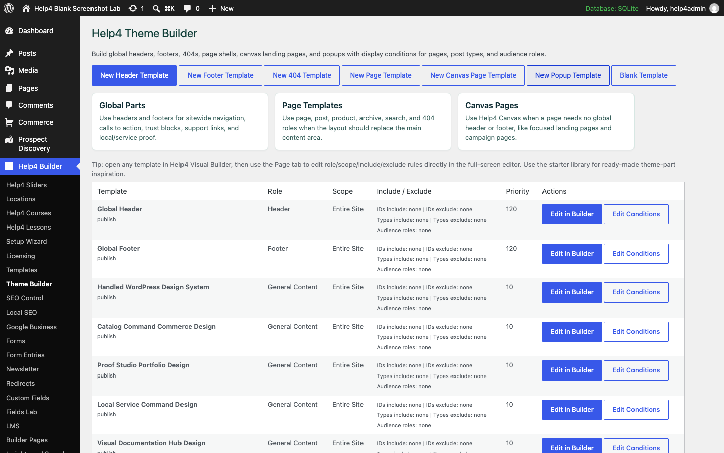
Screen 1
Theme Builder assignments
Review reusable headers, footers, content shells, archive templates, 404 output, conditions, and priorities.
Confirm: the page title, selected item, plugin version, and intended responsive view match the task.
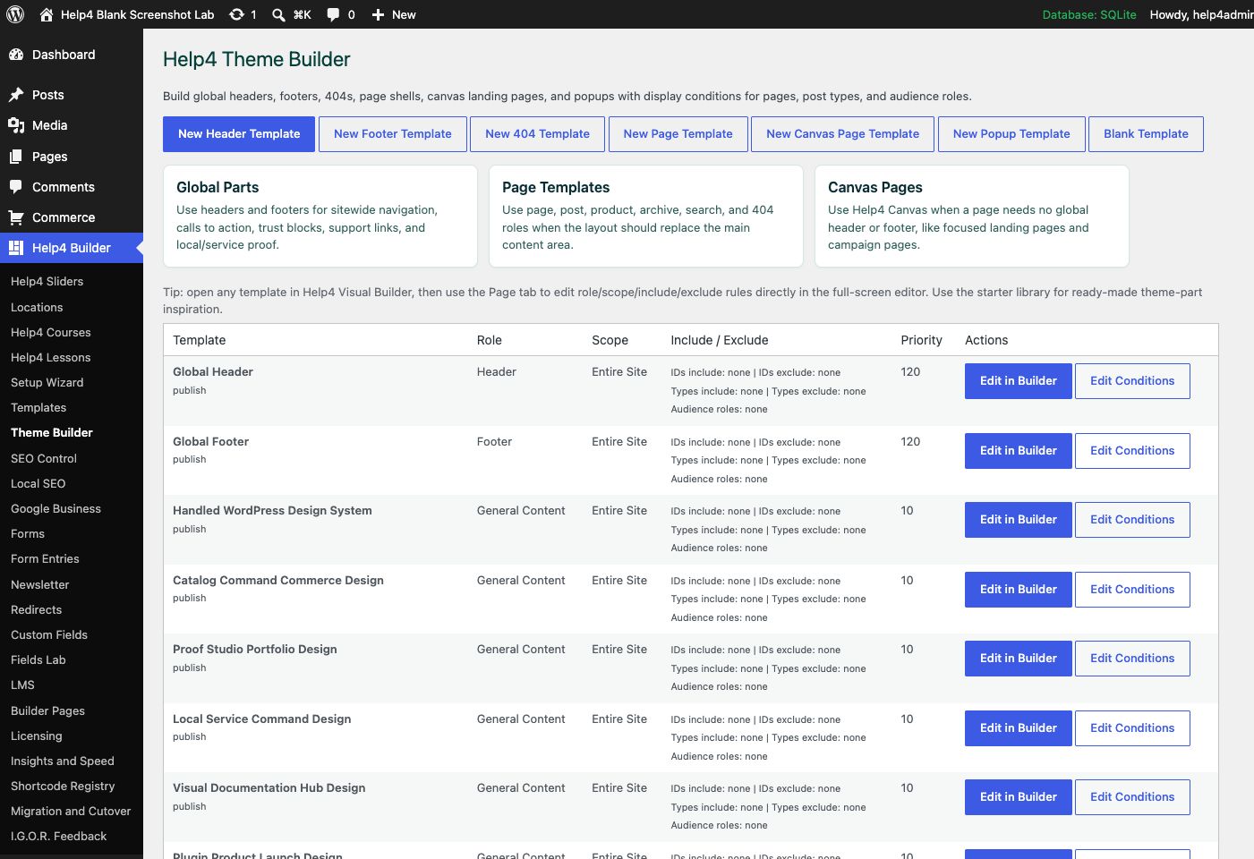
Screen 2
Theme Builder
Create global headers, footers, 404s, page shells, canvas landing pages, popups, and display conditions.
Confirm: the page title, selected item, plugin version, and intended responsive view match the task.
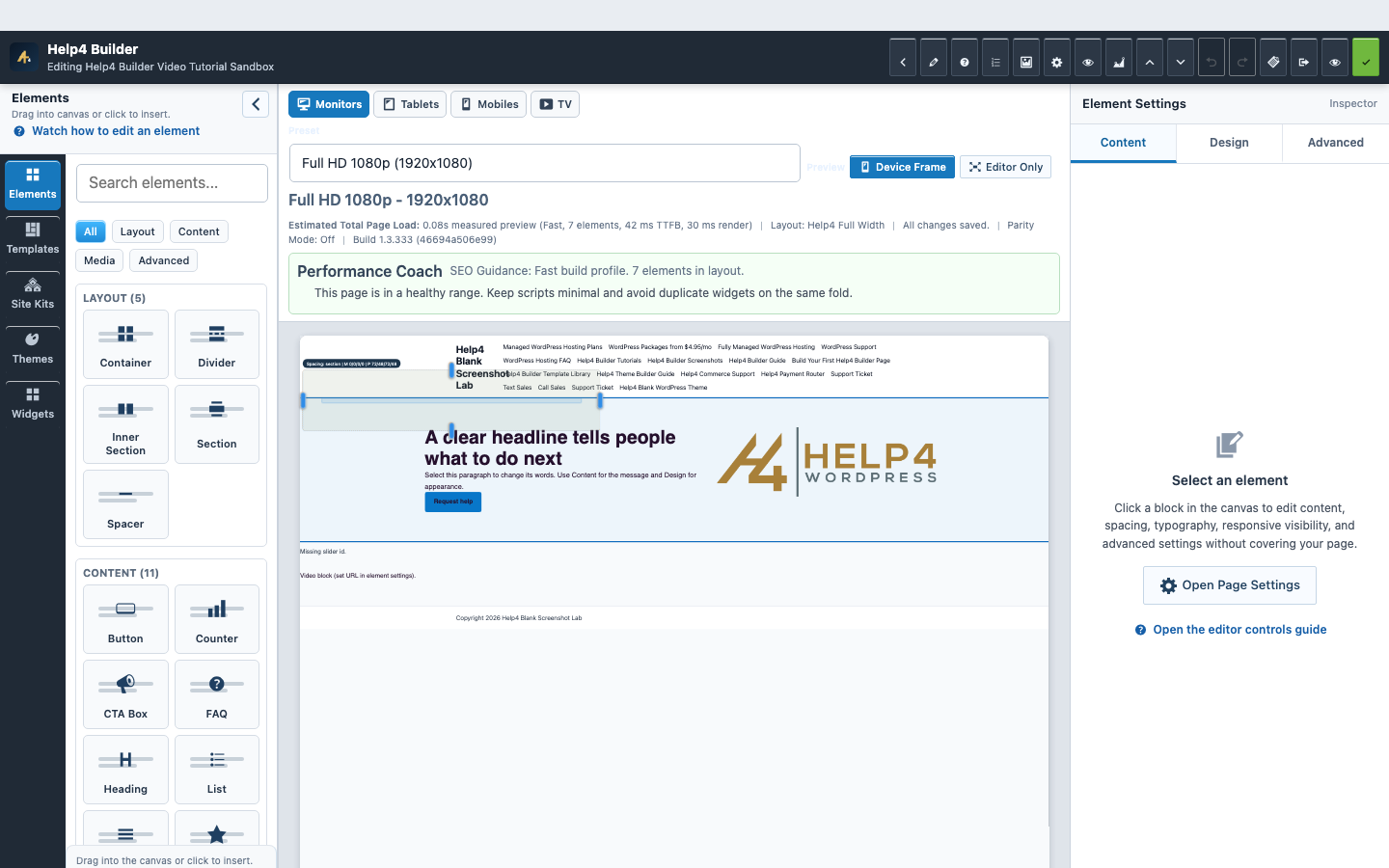
Screen 3
Current Studio workspace
See the element library, device controls, live page frame, inspector, performance guidance, and save state together.
Confirm: the page title, selected item, plugin version, and intended responsive view match the task.
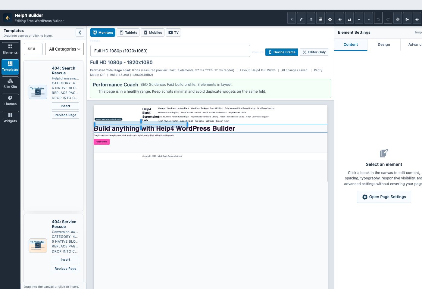
Screen 4
Builder Studio
Use the live page frame, element library, template library, inspector, responsive controls, performance guidance, and save state in one workspace.
Confirm: the page title, selected item, plugin version, and intended responsive view match the task.
Watch the real workflow
Watch the clicks before making the change.
Use the narrated walkthrough first, then follow the written steps and verification checks on this page.
Lesson 30
Mega Menus and Complex Navigation
Read the complete transcript
- Build Native Hierarchy
Begin in WordPress Menus and arrange parent and child destinations in a logical hierarchy. Enable the Help4 mega-menu container only on the parent that needs grouped content, then choose an appropriate column count and optional badge. The underlying links should remain understandable even without the expanded visual treatment.
- Place the Menu in a Header
Edit the global header template and insert the native menu component. Select the saved menu, set desktop alignment, dropdown placement, spacing, and the responsive breakpoint. Keep the logo, primary actions, and menu inside a structure that can shrink without clipping the last item.
- Test Pointer and Keyboard
On a desktop or tablet-width layout, move from the parent trigger into the submenu and confirm it remains open across the pointer path. Then use Tab, Enter, Space, and Escape. Every submenu link must be reachable, focus must remain visible, and leaving the menu should close it predictably.
- Test the Mobile Trigger
At the mobile breakpoint, verify one clearly named menu button opens and closes the complete hierarchy. The control should be large enough to tap, report its expanded state, trap no keyboard focus, and restore the page when closed. Long labels and nested items must wrap inside the viewport.
Lesson 8
Headers, Menus, and Mobile Navigation
Read the complete transcript
- Create a Header Template
Open Theme Builder and create or edit a header template. Reusable headers belong here so one controlled update can reach the assigned parts of the site.
- Insert the Menu Widget
In Studio, search the widget library for Menu. Insert the native component, then select the WordPress menu you want visitors to use.
- Configure Navigation
Set desktop orientation, dropdown behavior, submenu spacing, mobile breakpoint, and the compact menu trigger. Check that pointer and keyboard users can reach every submenu item.
- Assign and Test
Save the template conditions, then test a normal page on desktop and mobile. The mobile trigger should be visible, named, and able to open and close the complete menu.
Navigation architecture
Make the information hierarchy work before turning it into a large panel.
A mega menu should reduce decisions, not display every page the site owns; group destinations by visitor task and keep one predictable mobile version.
Hierarchy
Use clear parent labels, short child labels, and a manageable number of grouped destinations.
Pointer bridge
The desktop panel must stay open while the pointer moves from its trigger into the submenu.
Keyboard and touch
Triggers expose expanded state, focus can enter and leave every link, Escape closes, and touch never depends on hover.
Mobile containment
The panel, controls, text, and focus indicators fit 390px and 360px without horizontal clipping.
Guided walkthrough
Make one verified change at a time.
Each step includes the action, why it belongs in this order, and the checkpoint to verify before moving forward.
-
Map visitor tasks
Group destinations by what visitors need to accomplish and remove links that do not belong in primary navigation.
Why nowStarting from a confirmed target prevents a correct edit from being applied to the wrong page, template, product, or responsive view.
Done whenThe map visitor tasks result is visible, remains after reselecting the item, and has not changed unrelated content or styling.
-
Build WordPress hierarchy
Create parent and child menu items in WordPress so the navigation remains structured outside the visual styling layer.
Why nowCompleting and checking this step creates a known-good checkpoint before the next control changes the page state again.
Done whenThe build wordpress hierarchy result is visible, remains after reselecting the item, and has not changed unrelated content or styling.
-
Insert the menu element
Place Menu in the assigned global header and select the intended menu, desktop behavior, and mobile breakpoint.
Why nowCompleting and checking this step creates a known-good checkpoint before the next control changes the page state again.
Done whenThe insert the menu element result is visible, remains after reselecting the item, and has not changed unrelated content or styling.
-
Configure the large panel
Use grouped headings, columns, optional descriptions, and one highlighted action without nesting interactive cards.
Why nowCompleting and checking this step creates a known-good checkpoint before the next control changes the page state again.
Done whenThe configure the large panel result is visible, remains after reselecting the item, and has not changed unrelated content or styling.
-
Test desktop transitions
Move the pointer slowly and quickly across the trigger-panel gap, neighboring items, panel edges, and nested links.
Why nowCompleting and checking this step creates a known-good checkpoint before the next control changes the page state again.
Done whenThe test desktop transitions result is visible, remains after reselecting the item, and has not changed unrelated content or styling.
-
Test keyboard and touch
Use Tab, Shift-Tab, Enter, Space, Escape, outside click, and touch at tablet and phone widths.
Why nowCompleting and checking this step creates a known-good checkpoint before the next control changes the page state again.
Done whenThe test keyboard and touch result is visible, remains after reselecting the item, and has not changed unrelated content or styling.
-
Verify every assigned route
Test the global header on normal pages, templates, archives, search, 404, account, and checkout routes.
Why nowThe final verification separates an editor preview from a result that is actually saved, responsive, interactive, and ready for visitors.
Done whenThe verify every assigned route result is visible, remains after reselecting the item, and has not changed unrelated content or styling.
Release check
Test the real public or member outcome, not only the settings screen.
Reopen the saved setting, run the intended workflow in the correct visitor state, test desktop and phone behavior where a frontend surface exists, and inspect fresh browser or PHP errors from the same attempt.
Persistence
The saved values remain correct after reload and do not overwrite newer settings from another session.
Public behavior
The intended visitor can complete the workflow and an unintended visitor cannot access protected output.
Responsive behavior
Controls, text, tables, media, dialogs, and focus stay visible and usable at 768px, 390px, and 360px.
Fresh evidence
The final request has the expected status, output, cache state, and no new related console or PHP error.
Common questions
Answers for the decisions that block this setup most often.
Does a mega menu replace WordPress menu hierarchy?
No. Keep the WordPress menu as the content structure and use Builder controls to present it as a larger responsive panel.
Why does a submenu disappear before it can be clicked?
A pointer gap or immediate close handler can end the hover state before the pointer reaches the panel; the trigger and panel need a continuous interaction region.
Should mobile navigation depend on hover?
No. Mobile navigation needs explicit touch controls, visible expanded state, focus management, and a reliable close action.
Continue learning
Use the next guide that matches the work in front of you.
The full tutorial hub remains available without repeating dozens of unrelated cards on this page.
Start here
Install and setup
Download the ZIP, activate Builder Suite, understand the blank-theme path, and run the first clean check.
First page
Build a page safely
Open Builder Pages, launch Studio, build structure first, check mobile, then publish or hand it to Help4.
Editor controls
Know which tab changes what
Use Content for information, Design for appearance and responsive values, and Advanced for identity, attributes, visibility, and motion.
Recovery
Edit without losing work
Replace media safely, recognize stale drafts, and restore a known-good page snapshot from Page Settings History.
Responsive
Control every viewport
Set spacing, widths, columns, alignment, and typography independently for desktop, tablet, and mobile.
Templates
Choose a starter
Pick a starter spec by page job: service, product, support, recent work, local SEO, launch, or checkout recovery.
Need a second set of eyes?
Send one complete, privacy-safe support record.
Include the affected URL or admin screen, current Builder version, user state, exact steps, expected result, actual result, and one screenshot or fresh error when available.