
Help4 Builder Widget Library
Before the first click
Confirm what you are editing and where each kind of change belongs.
Read the page or template title first, select the exact element in the canvas or Navigator, then use the inspector tab that matches the job. This prevents a content change from becoming an accidental layout change.
Content
Change words, links, images, icons, data sources, shortcodes, and element-specific information.
Design
Change colors, typography, spacing, borders, radius, alignment, states, and desktop, tablet, or mobile values.
Advanced
Change labels, anchors, classes, attributes, visibility rules, motion, and other expert controls.
Page Settings
Use page-wide history, globals, publishing, template assignment, and recovery controls instead of editing one element.
Visual orientation
Match the screen before following the steps.
Open each image at full size. The numbered notes explain what the screen controls and what to confirm before changing customer content.
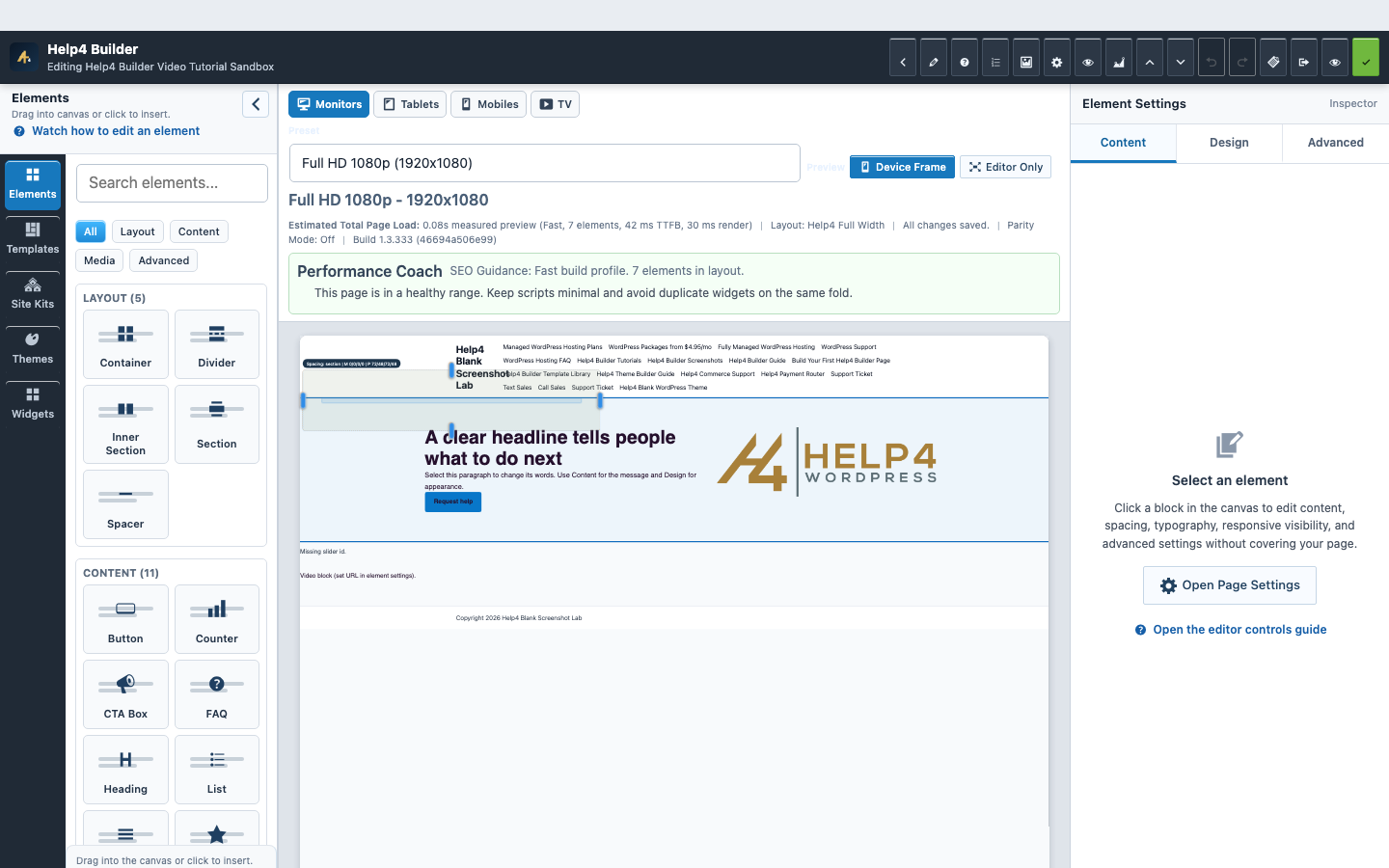
Screen 1
Current Studio workspace
See the element library, device controls, live page frame, inspector, performance guidance, and save state together.
Confirm: the page title, selected item, plugin version, and intended responsive view match the task.
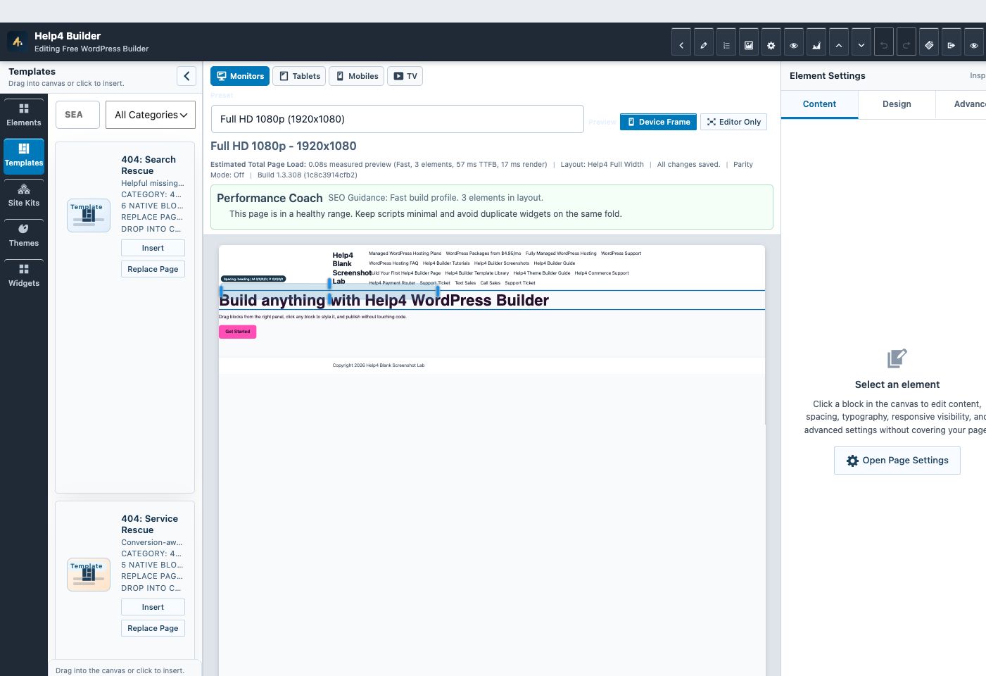
Screen 2
Builder Studio
Use the live page frame, element library, template library, inspector, responsive controls, performance guidance, and save state in one workspace.
Confirm: the page title, selected item, plugin version, and intended responsive view match the task.
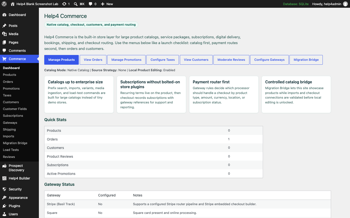
Screen 3
Commerce operations
Review catalog, orders, customers, subscriptions, payment routing, and store health from the native commerce hub.
Confirm: the page title, selected item, plugin version, and intended responsive view match the task.
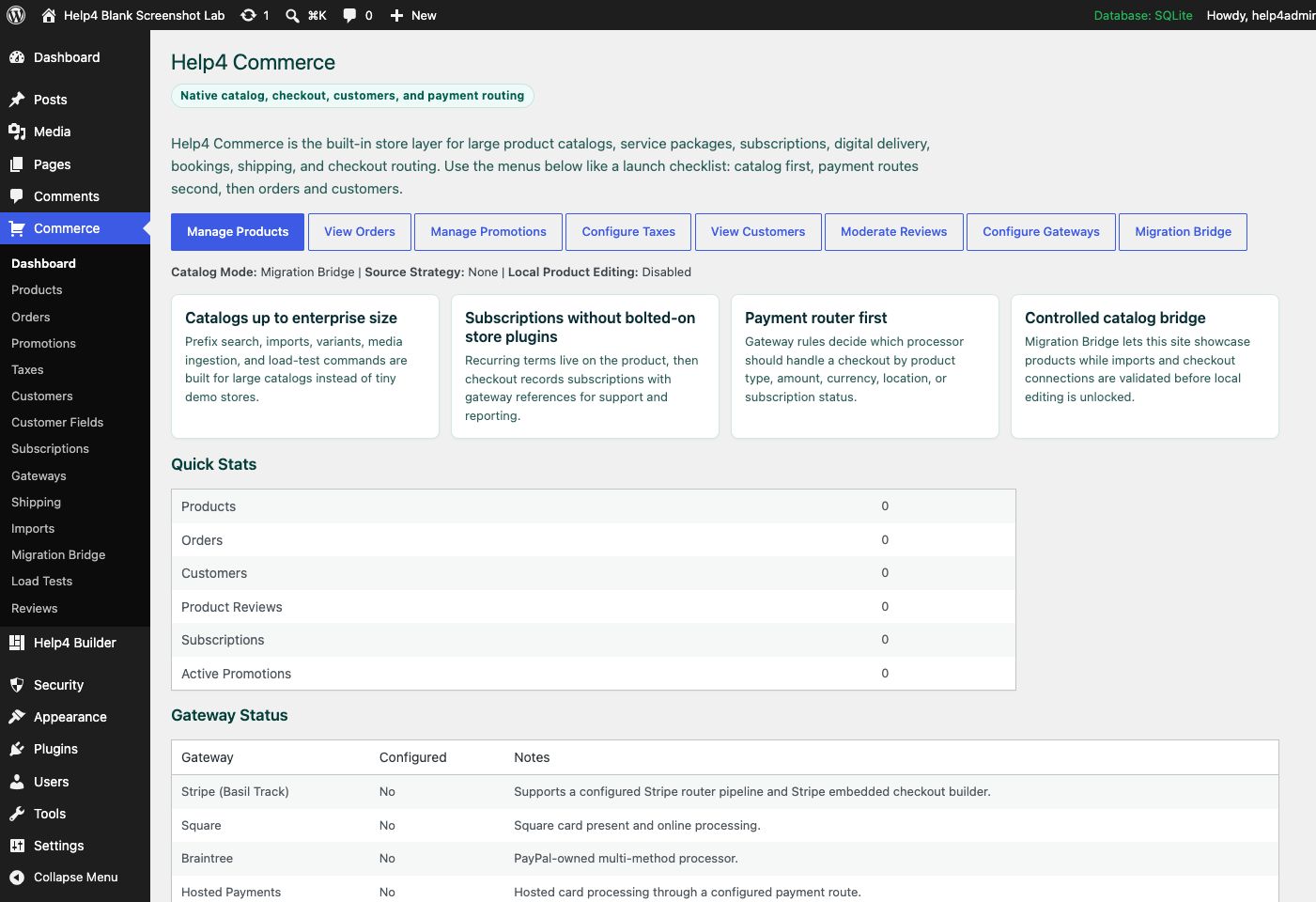
Screen 4
Commerce dashboard
Review products, orders, customers, subscriptions, gateway routing, imports, and migration tools from one commerce hub.
Confirm: the page title, selected item, plugin version, and intended responsive view match the task.
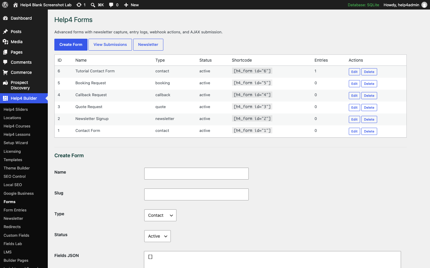
Screen 5
Forms and delivery
Create and verify forms, delivery, submissions, consent, and spam controls as one complete workflow.
Confirm: the page title, selected item, plugin version, and intended responsive view match the task.
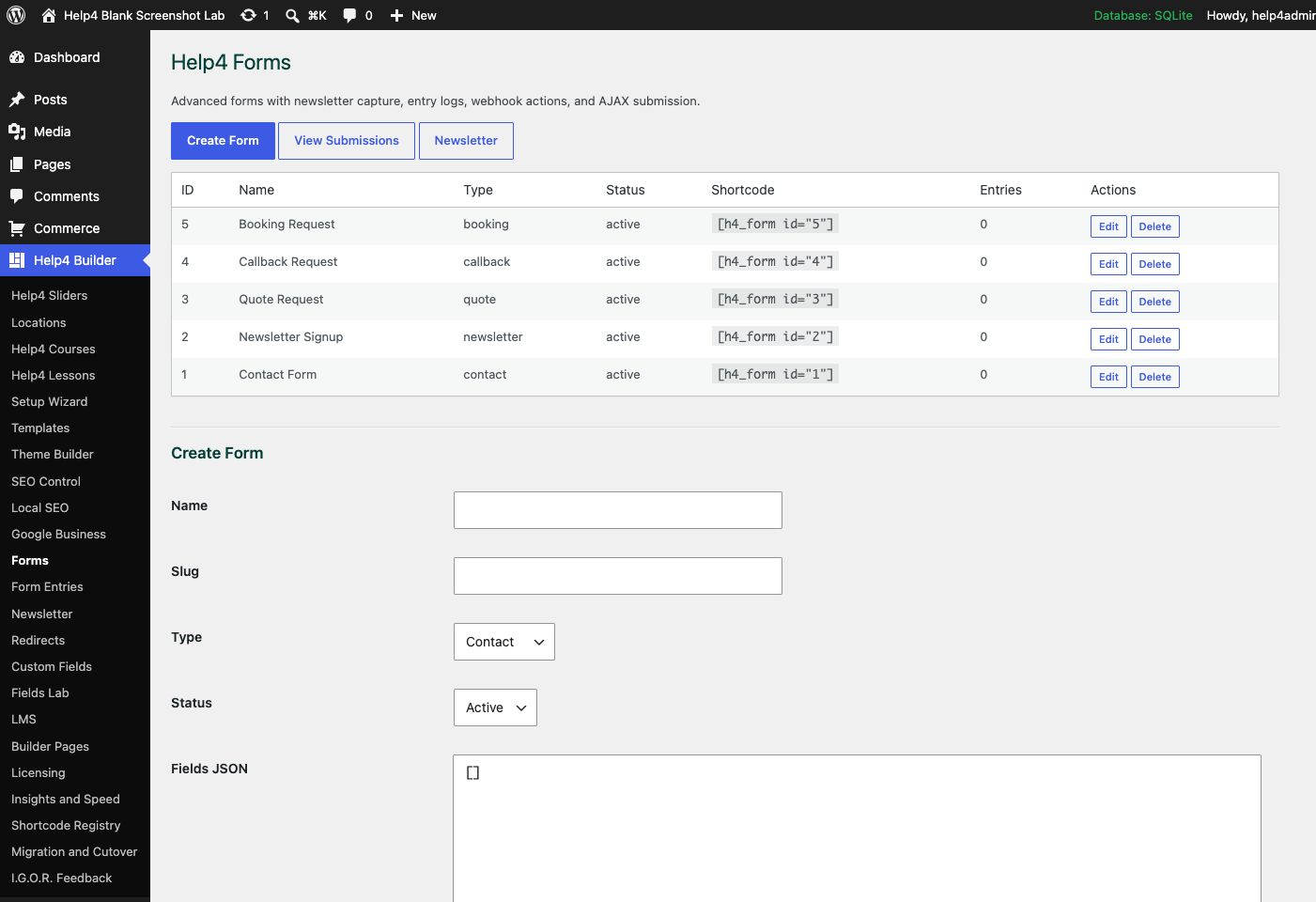
Screen 6
Forms
Create quote, contact, newsletter, booking, and support forms with clear routing and confirmation messages.
Confirm: the page title, selected item, plugin version, and intended responsive view match the task.
Watch the real workflow
Watch the clicks before making the change.
Use the narrated walkthrough first, then follow the written steps and verification checks on this page.
Lesson 40
Widget Library, Favorites, and Addon Modules
Find the right Builder element, keep trusted widgets close, and understand when an addon module owns its own data, assets, and controls.
Read the complete transcript
- Search by the Job
Open Widgets and search for the job you need, such as menu, form, image, product, course, search, video, or dynamic field. Read the widget name and category before inserting it. Similar-looking elements can own different content, accessibility behavior, scripts, and data contracts.
- Use Favorites and Recent Items
Favorite the small set of widgets your team uses correctly and use the Recent filter while building related sections. Favorites do not disable the rest of the catalog; they reduce hunting and help newer editors start from approved components. Remove a favorite when the team has replaced that pattern.
- Configure the Element, Not Its Parent
Select the inserted widget in Navigator or the preview, then edit its Content, Design, and Advanced settings. Use the parent section for layout and the widget for its own data and presentation. When a registered addon module supplies the element, keep its wrapper and extension settings intact through save and reload.
- Verify Assets and Empty States
Check that the widget loads only the styles and scripts it needs on the public page and inside Studio. Test normal data, no data, loading, error, signed-out, and mobile states where they apply. A widget is complete only when it survives save, reopen, responsive preview, and public rendering without a missing dependency.
Widget workflow
Choose the smallest component that completes the job.
A purpose-built widget should expose its real settings, load its own assets only when used, inherit global tokens, and preserve addon extension data through save and reload.
Keep extension data
Unknown namespaced addon settings survive edit, save, export, import, and preview normalization.
Avoid global asset bloat
A widget loads its required assets on pages that use it instead of adding every module stylesheet and script sitewide.
Keep empty states intentional
Counts, carts, customer fields, products, and dynamic modules explain or hide empty data according to their configured behavior.
Guided walkthrough
Make one verified change at a time.
Each step includes the action, why it belongs in this order, and the checkpoint to verify before moving forward.
-
Search by outcome
Search for the job such as menu, form, product, cart, reviews, FAQ, video, gallery, or dynamic content instead of browsing every module.
Why nowStarting from a confirmed target prevents a correct edit from being applied to the wrong page, template, product, or responsive view.
Done whenThe search by outcome result is visible, remains after reselecting the item, and has not changed unrelated content or styling.
-
Inspect the source
Read the widget name and category, then confirm whether it is native Builder functionality or a registered addon module with its own data requirements.
Why nowCompleting and checking this step creates a known-good checkpoint before the next control changes the page state again.
Done whenThe inspect the source result is visible, remains after reselecting the item, and has not changed unrelated content or styling.
-
Insert into the correct parent
Select the intended section, container, or column first, then click or drag the widget and confirm its new layer in Navigator.
Why nowCompleting and checking this step creates a known-good checkpoint before the next control changes the page state again.
Done whenThe insert into the correct parent result is visible, remains after reselecting the item, and has not changed unrelated content or styling.
-
Complete Content settings
Set the actual text, media, data source, links, product context, labels, empty state, and accessibility information before decorative styling.
Why nowCompleting and checking this step creates a known-good checkpoint before the next control changes the page state again.
Done whenThe complete content settings result is visible, remains after reselecting the item, and has not changed unrelated content or styling.
-
Complete Design settings
Set typography, colors, spacing, width, states, and independent responsive values while watching the same element in Live Preview.
Why nowCompleting and checking this step creates a known-good checkpoint before the next control changes the page state again.
Done whenThe complete design settings result is visible, remains after reselecting the item, and has not changed unrelated content or styling.
-
Complete Advanced settings
Add a useful Navigator label, stable anchor or class only when needed, visibility rules, attributes, and accessible motion behavior.
Why nowCompleting and checking this step creates a known-good checkpoint before the next control changes the page state again.
Done whenThe complete advanced settings result is visible, remains after reselecting the item, and has not changed unrelated content or styling.
-
Test the real state matrix
Check empty and populated data, logged-out and allowed user states, keyboard use, reduced motion, slow or failed media, 390px, 360px, and the public page after publish.
Why nowThe final verification separates an editor preview from a result that is actually saved, responsive, interactive, and ready for visitors.
Done whenThe test the real state matrix result is visible, remains after reselecting the item, and has not changed unrelated content or styling.
How to know it worked
Verify the edit in Studio and on the real page.
A successful edit stays visible when the element is reselected, matches the intended responsive view, survives publish, and appears on the public URL without clipping or lost styling.
Studio preview
Reselect the element and confirm the saved value and visual result are still present.
Responsive preview
Check desktop, tablet, 390px, and 360px widths for overflow, squeezed controls, and inherited values.
Public page
Open the public route in a new tab after publishing and confirm content, interactions, assets, and spacing.
Recovery
If the result is wrong, stop editing and use History or a known-good revision instead of rebuilding the page.
Avoid the expensive mistakes
Stop when the page stops behaving predictably.
More edits do not repair a bad state. Preserve the evidence, return to a known revision, and reproduce the smallest failing action.
Changing several controls at once
Change one content, design, or responsive value, then confirm it in the preview. A small edit is easier to understand and recover.
Editing the wrong layer
Use Navigator and read the inspector heading. Deleting a parent section can remove every child even when the selected text or image looked harmless.
Checking only desktop
Review tablet, 390px, and 360px before publish. Width, gap, padding, type, alignment, controls, and menus can inherit differently.
Publishing before values persist
Reselect the element and reopen the responsive view. If the value disappears or another tab has a newer revision, reconcile it before publishing.
Continue learning
Use the next guide that matches the work in front of you.
The full tutorial hub remains available without repeating dozens of unrelated cards on this page.
Start here
Install and setup
Download the ZIP, activate Builder Suite, understand the blank-theme path, and run the first clean check.
First page
Build a page safely
Open Builder Pages, launch Studio, build structure first, check mobile, then publish or hand it to Help4.
Editor controls
Know which tab changes what
Use Content for information, Design for appearance and responsive values, and Advanced for identity, attributes, visibility, and motion.
Recovery
Edit without losing work
Replace media safely, recognize stale drafts, and restore a known-good page snapshot from Page Settings History.
Responsive
Control every viewport
Set spacing, widths, columns, alignment, and typography independently for desktop, tablet, and mobile.
Templates
Choose a starter
Pick a starter spec by page job: service, product, support, recent work, local SEO, launch, or checkout recovery.
Need help with this step?
Send Help4 the page, screenshot, or site goal.
Include the URL, what you are trying to build, what looks wrong, and whether this is a draft, staging site, or live customer page.