
Help4 Theme Builder Template Conditions
Before the first click
Confirm what you are editing and where each kind of change belongs.
Read the page or template title first, select the exact element in the canvas or Navigator, then use the inspector tab that matches the job. This prevents a content change from becoming an accidental layout change.
Content
Change words, links, images, icons, data sources, shortcodes, and element-specific information.
Design
Change colors, typography, spacing, borders, radius, alignment, states, and desktop, tablet, or mobile values.
Advanced
Change labels, anchors, classes, attributes, visibility rules, motion, and other expert controls.
Page Settings
Use page-wide history, globals, publishing, template assignment, and recovery controls instead of editing one element.
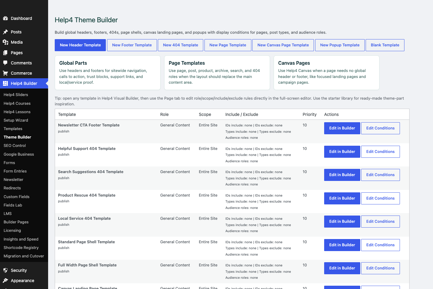
Theme Builder
Create global headers, footers, 404s, page shells, canvas landing pages, popups, and display conditions.
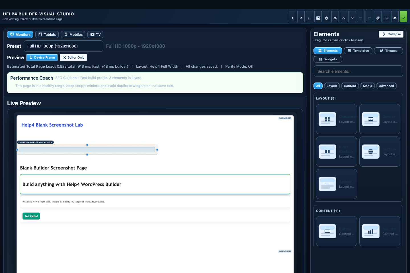
Builder Studio
Build the page visually with responsive controls, element panels, performance guidance, and a live preview.
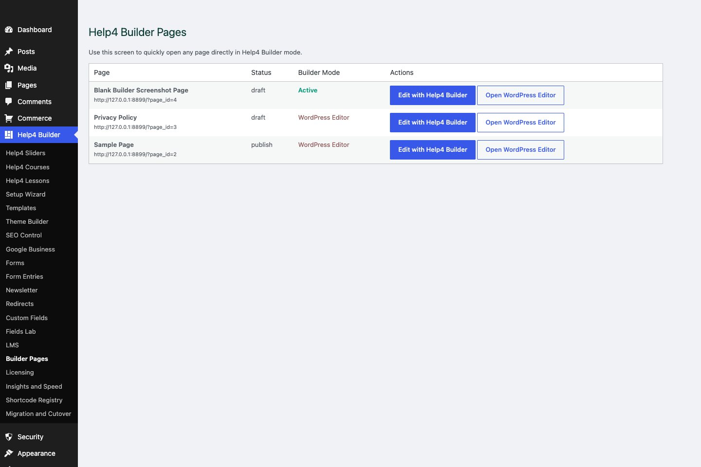
Builder Pages
Find builder-enabled pages, open Builder Studio, and keep drafts separate from live customer pages.
Condition workflow
Start broad, then add deliberate exceptions.
Use one normal site shell, add only the exceptions the design requires, and test a representative route for every rule.
No duplicate shell
A request should render one winning header, footer, and content template.
Assets follow assignment
Assigned archive, search, and 404 templates need the same Builder assets as singular output.
Studio uses template layout
Editing a template must preview its own saved or draft layout, not the front page.
Step 1
Choose the role
Select header, footer, single, archive, search, 404, canvas page, popup, or reusable section based on the output job.
Step 2
Choose the scope
Use entire site only for true defaults; use singular, archive, search, 404, or content-type scope for targeted templates.
Step 3
Add includes
Limit the template to approved post types, records, taxonomies, or routes when the scope is still too broad.
Step 4
Add exclusions
Remove checkout, landing pages, protected content, or other intentional exceptions from a broad assignment.
Step 5
Resolve priority
Give the narrower valid rule a higher priority and avoid equal-priority overlaps that are hard to explain.
Step 6
Test the matrix
Check home, normal page, post, custom post, archive, search, 404, checkout, logged-in state, and mobile navigation.
How to know it worked
Verify the edit in Studio and on the real page.
A successful edit stays visible when the element is reselected, matches the intended responsive view, survives publish, and appears on the public URL without clipping or lost styling.
Studio preview
Reselect the element and confirm the saved value and visual result are still present.
Responsive preview
Check desktop, tablet, 390px, and 360px widths for overflow, squeezed controls, and inherited values.
Public page
Open the public route in a new tab after publishing and confirm content, interactions, assets, and spacing.
Recovery
If the result is wrong, stop editing and use History or a known-good revision instead of rebuilding the page.
Start here
Install and setup
Download the ZIP, activate Builder Suite, understand the blank-theme path, and run the first clean check.
First page
Build a page safely
Open Builder Pages, launch Studio, build structure first, check mobile, then publish or hand it to Help4.
Editor controls
Know which tab changes what
Use Content for information, Design for appearance and responsive values, and Advanced for identity, attributes, visibility, and motion.
WP-CLI runners
Automate guarded site work
Prepare compatible seed, migration, launch, repair, audit, and recovery runners without removing safety checks.
Sales homepage
Turn an offer into a complete page
Build open content bands for the offer, proof, services, pricing, process, FAQ, and final contact action.
Pricing comparison
Compare up to five plans clearly
Use semantic feature rows, honest plan labels, readable calls to action, and mobile layouts that never squeeze five columns.
FAQ accordion
Answer objections accessibly
Build keyboard-ready disclosure controls and valid FAQPage schema without hidden or duplicate answers.
Live preview
See edits before publish
Use isolated draft preview, responsive views, interactive asset checks, and explicit publishing.
Save and publish
Know what becomes public
Understand element publishing, page drafts, revision conflicts, History, and the final public verification step.
Navigator
Understand page layers
Rename, reorder, duplicate, and remove nested sections, containers, columns, and widgets without damaging the tree.
Recovery
Edit without losing work
Replace media safely, recognize stale drafts, and restore a known-good page snapshot from Page Settings History.
Images
Work with media safely
Replace, crop, size, optimize, describe, and verify images without resetting sibling content or styles.
Design controls
Buttons, type and spacing
Control tokens, typography, padding, gap, radius, states, and responsive values in Studio.
Responsive
Control every viewport
Set spacing, widths, columns, alignment, and typography independently for desktop, tablet, and mobile.
Templates
Choose a starter
Pick a starter spec by page job: service, product, support, recent work, local SEO, launch, or checkout recovery.
Design system
Globals and theme packs
Control semantic colors, type, spacing, and style-only packs without replacing the current page layout.
Theme layer
Headers and footers
Use Theme Builder for global headers, footers, 404s, page shells, canvas pages, popups, and conditions.
Header/footer launch
Finish the shared site shell
Preserve the exact logo, build native navigation and mobile controls, add legal/support routes, and test template assignments.
Template conditions
Control where templates appear
Use role, scope, content type, includes, excludes, and priority without duplicate or missing site shells.
Reusable sections
Update shared content safely
Choose between copied, reusable, and truly global sections for calls to action, proof, forms, and repeated content.
Navigation
Menus that stay usable
Build hierarchy, hover dropdowns, keyboard paths, mobile menus, and global header assignments.
Fields
Structured content
Use fields when content repeats: FAQs, service areas, specs, team members, galleries, relationships, and product data.
Dynamic data
Bind reusable templates
Connect approved post, taxonomy, author, site, product, variant, relationship, and repeater values to widgets.
Commerce
Products and payments
Plan catalog data, variations, subscriptions, checkout context, and payment routing before launch.
Commerce operations
Products and customer fields
Configure variants, subscriptions, dynamic customer data, payment routes, and full order-lifecycle checks.
Commerce launch
Test the entire order lifecycle
Verify catalog, variation, customer-field, tax, shipping, payment, webhook, subscription, refund, email, and mobile paths.
Stripe routing
Multiple Stripe accounts
Connect accounts, build product and geographic assignments, validate checkout, and compare Pro with Enterprise.
CDN and WAF
Help4 Net edge delivery
Compare free plugin onboarding, the $8 Pro GeoDNS/CDN path, and the $20 managed proxy/WAF service.
Capture leads
Forms and sliders
Use forms and motion only where they support the page goal and do not load extra assets everywhere.
Forms
Test lead delivery
Configure accessible fields, consent, actions, validation, spam controls, delivery, and complete submission states.
Motion
Build accessible sliders
Set triggers, duration, delay, easing, controls, responsive behavior, and reduced-motion fallbacks.
Migration
Import and export safely
Map layouts, tokens, templates, fields, media, links, and extension data with structural verification.
Launch QA
SEO, speed, security
Check metadata, schema, readability, AdSense-style quality, Analytics intent, SSL, headers, images, and mobile.
Search visibility
Local and international SEO
Configure business entities, social previews, schema, languages, IndexNow, sitemaps, and indexing health.
Networks
WordPress multisite
Provision sensible defaults while keeping each site isolated, editable, indexable, and operationally bounded.
Troubleshooting
Migrate with evidence
Check preview parity, media URLs, active theme assets, caching, logs, and recovery history before changing code.
Proof
Website Snapshot
Turn public URLs into safe website screenshots for recent work, migrations, support notes, and launch recaps.
Release safety
Updates
Use stable live packages and md beta testing to keep Builder Suite ready for the next WordPress line.
Need help with this step?
Send Help4 the page, screenshot, or site goal.
Include the URL, what you are trying to build, what looks wrong, and whether this is a draft, staging site, or live customer page.