
Help4 Builder Sections, Containers and Columns
Before the first click
Confirm what you are editing and where each kind of change belongs.
Read the page or template title first, select the exact element in the canvas or Navigator, then use the inspector tab that matches the job. This prevents a content change from becoming an accidental layout change.
Content
Change words, links, images, icons, data sources, shortcodes, and element-specific information.
Design
Change colors, typography, spacing, borders, radius, alignment, states, and desktop, tablet, or mobile values.
Advanced
Change labels, anchors, classes, attributes, visibility rules, motion, and other expert controls.
Page Settings
Use page-wide history, globals, publishing, template assignment, and recovery controls instead of editing one element.
Visual orientation
Match the screen before following the steps.
Open each image at full size. The numbered notes explain what the screen controls and what to confirm before changing customer content.
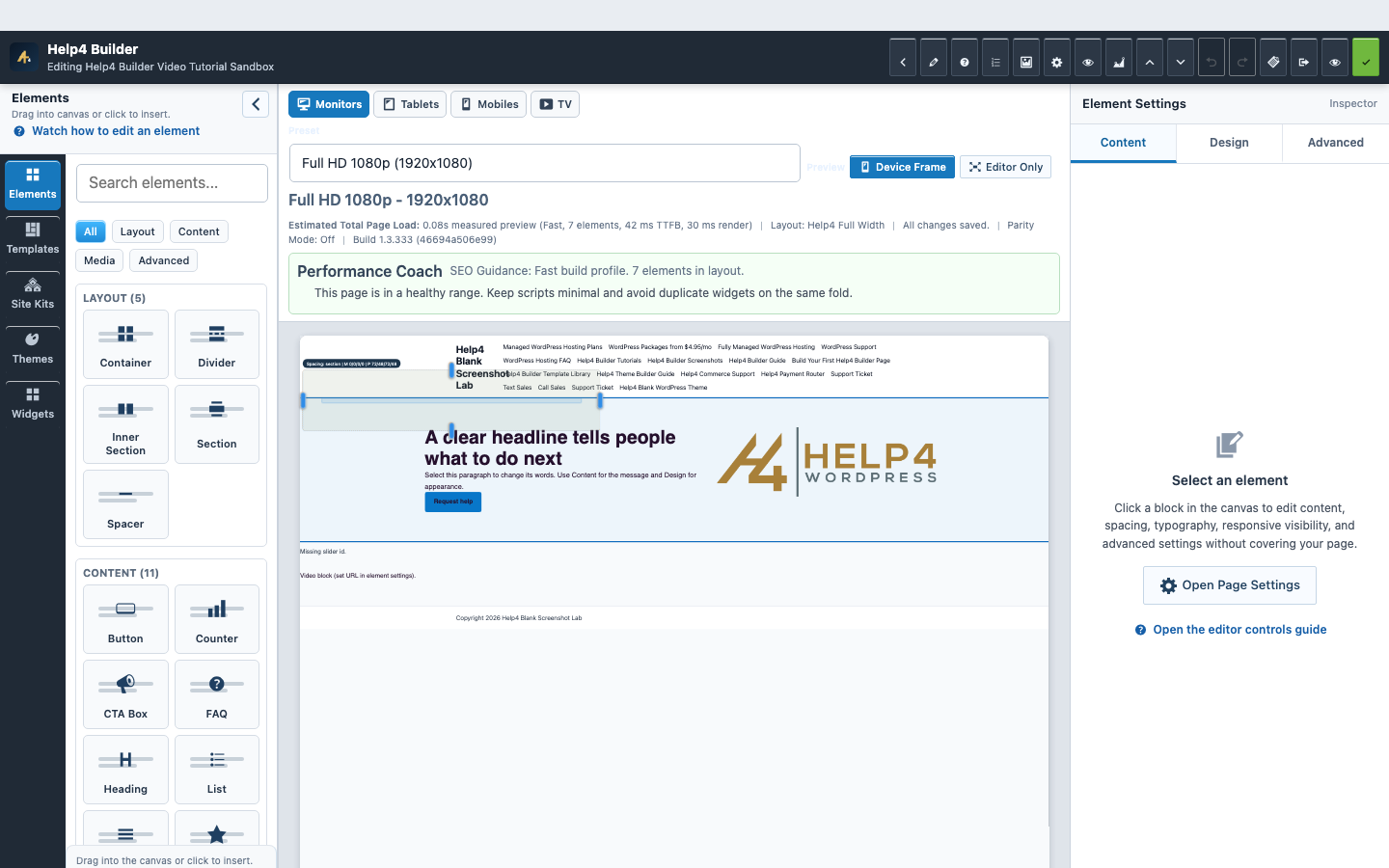
Screen 1
Current Studio workspace
See the element library, device controls, live page frame, inspector, performance guidance, and save state together.
Confirm: the page title, selected item, plugin version, and intended responsive view match the task.
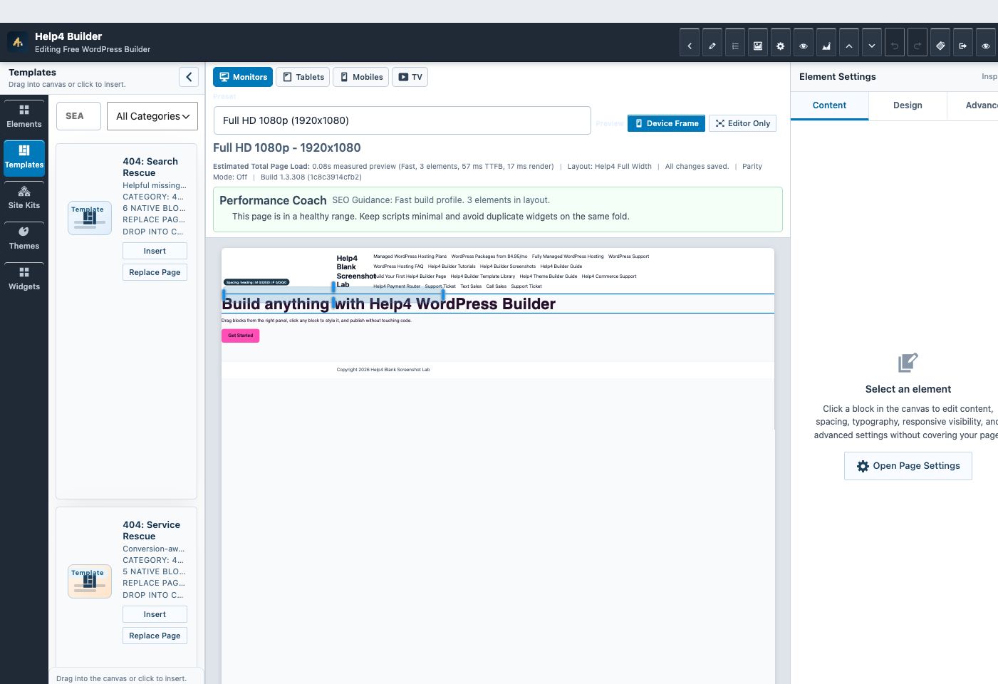
Screen 2
Builder Studio
Use the live page frame, element library, template library, inspector, responsive controls, performance guidance, and save state in one workspace.
Confirm: the page title, selected item, plugin version, and intended responsive view match the task.
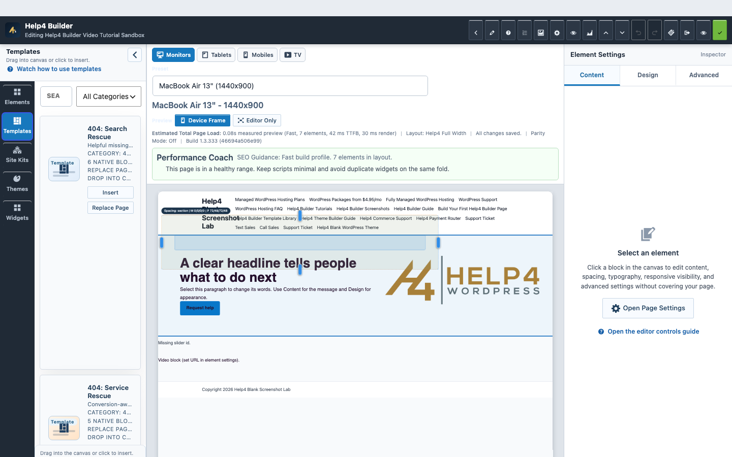
Screen 3
Templates in Studio
Browse reusable structures and choose an insertion or replacement path intentionally.
Confirm: the page title, selected item, plugin version, and intended responsive view match the task.
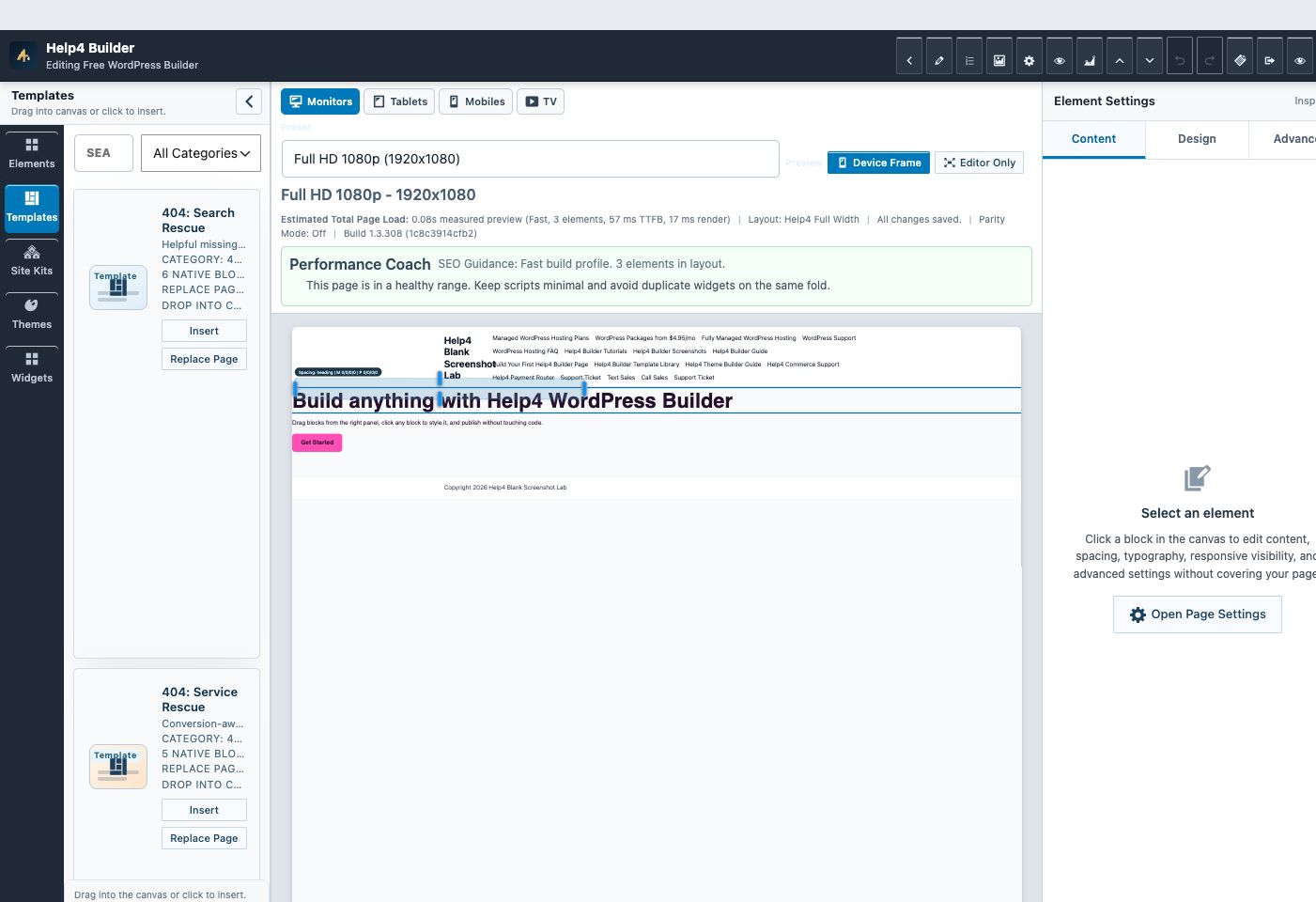
Screen 4
Template Library
Search page-purpose starters, insert a section, or deliberately replace a page instead of beginning from an empty screen.
Confirm: the page title, selected item, plugin version, and intended responsive view match the task.
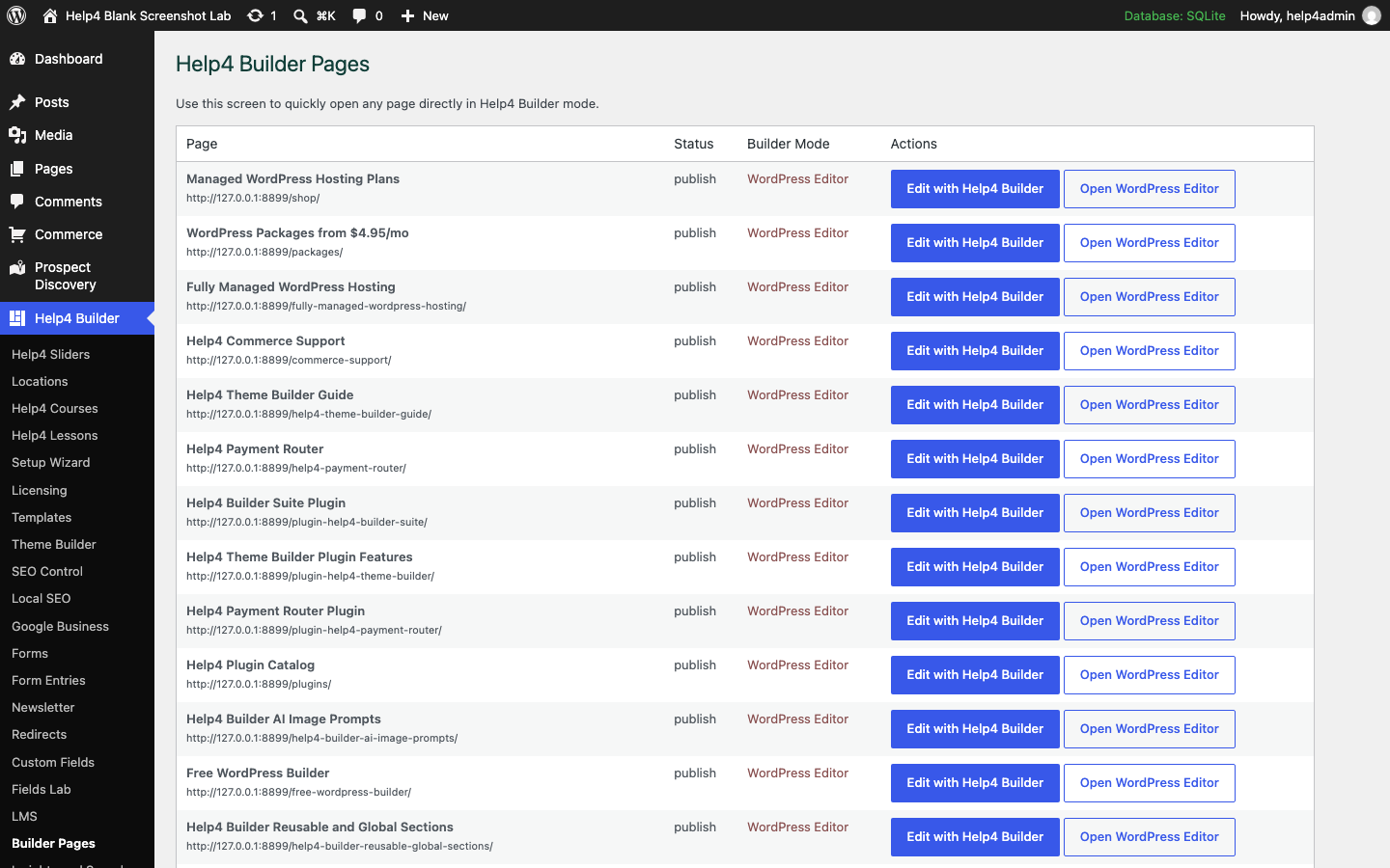
Screen 5
Open the correct page
Find the intended page and open Studio without confusing it with a reusable template or similarly named draft.
Confirm: the page title, selected item, plugin version, and intended responsive view match the task.
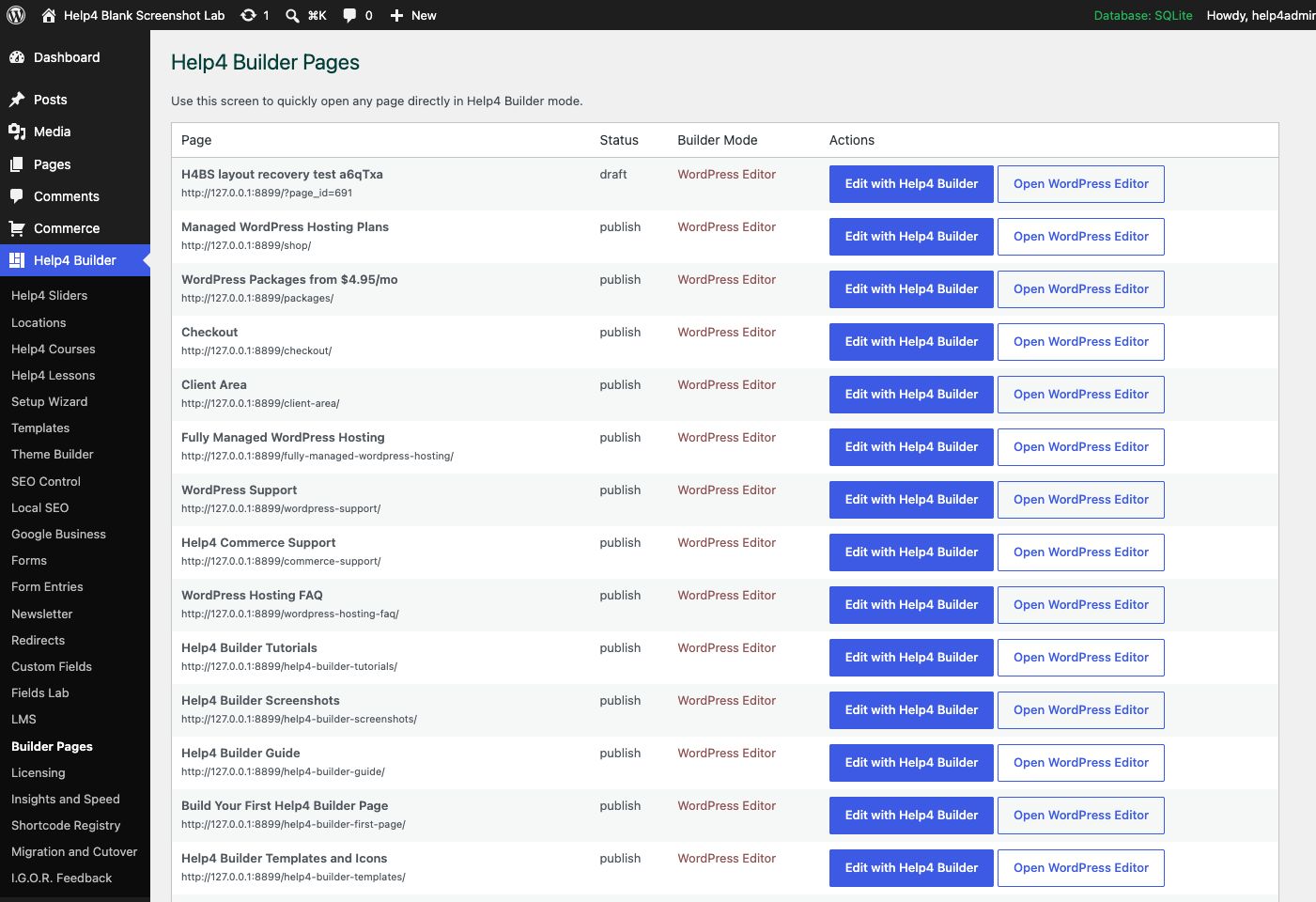
Screen 6
Builder Pages
Find Builder-enabled pages, open Builder Studio, and keep drafts separate from live customer pages.
Confirm: the page title, selected item, plugin version, and intended responsive view match the task.
Watch the real workflow
Watch the clicks before making the change.
Use the narrated walkthrough first, then follow the written steps and verification checks on this page.
Lesson 7
Sections, Containers, and Columns
Understand the layout hierarchy, choose grid or flex behavior, and set responsive gaps, widths, and stacking.
Read the complete transcript
- Read the Hierarchy
Navigator shows the page hierarchy. A section contains columns or inner containers, and those containers hold headings, images, buttons, and other content elements.
- Choose the Layout
Select the parent section and open Design. Choose grid or flex behavior, then set column structure, alignment, wrapping, content width, and overflow intentionally.
- Control Space
Use gap for space between children and padding for space inside the parent. Avoid stacking large margins and padding until the layout becomes unpredictable.
- Set Responsive Structure
On tablet and mobile, change columns, stacking, gap, width, and alignment as needed. The mobile layout should read in a logical order without custom CSS.
Structure workflow
Build the page skeleton before styling individual widgets.
Use Navigator while building so every child has the intended parent and slot, then set responsive values at the structure level before fixing individual elements.
One width owner
A grid track owns its child width; avoid percentage-squaring a child inside an already-sized track.
Valid tree
Every nested element has one existing parent, a valid slot, and a unique ID.
Content order
Mobile visual and accessibility order should match the reading and action sequence.
Guided walkthrough
Make one verified change at a time.
Each step includes the action, why it belongs in this order, and the checkpoint to verify before moving forward.
-
Add the outer section
Insert one Section for each meaningful page band, give it a clear Navigator name, and choose the background and vertical spacing for that band.
Why nowStarting from a confirmed target prevents a correct edit from being applied to the wrong page, template, product, or responsive view.
Done whenThe add the outer section result is visible, remains after reselecting the item, and has not changed unrelated content or styling.
-
Add a content container
Place a Container inside the section when text and controls need a readable maximum width; use full width only when the design truly reaches the viewport edge.
Why nowCompleting and checking this step creates a known-good checkpoint before the next control changes the page state again.
Done whenThe add a content container result is visible, remains after reselecting the item, and has not changed unrelated content or styling.
-
Choose grid or flex
Use Grid for defined columns and consistent tracks. Use Flex for directional rows, wrapping groups, alignment, and content-sized items.
Why nowCompleting and checking this step creates a known-good checkpoint before the next control changes the page state again.
Done whenThe choose grid or flex result is visible, remains after reselecting the item, and has not changed unrelated content or styling.
-
Set columns and ratios
Choose the occupied column count, then set intentional ratios. Grid children fill their track; the track owns the width and the gap remains inside the available container.
Why nowCompleting and checking this step creates a known-good checkpoint before the next control changes the page state again.
Done whenThe set columns and ratios result is visible, remains after reselecting the item, and has not changed unrelated content or styling.
-
Place children by parent and slot
Select the correct parent before inserting headings, text, media, buttons, forms, or nested containers; verify the result in Navigator.
Why nowCompleting and checking this step creates a known-good checkpoint before the next control changes the page state again.
Done whenThe place children by parent and slot result is visible, remains after reselecting the item, and has not changed unrelated content or styling.
-
Set breakpoint values
Adjust columns, direction, wrap, gap, padding, min height, width mode, and alignment independently for desktop, tablet, and mobile.
Why nowCompleting and checking this step creates a known-good checkpoint before the next control changes the page state again.
Done whenThe set breakpoint values result is visible, remains after reselecting the item, and has not changed unrelated content or styling.
-
Check the boundaries
Preview 1025, 1024, 768, 767, 390, and 360 pixels so a breakpoint change never squeezes content or creates horizontal overflow.
Why nowThe final verification separates an editor preview from a result that is actually saved, responsive, interactive, and ready for visitors.
Done whenThe check the boundaries result is visible, remains after reselecting the item, and has not changed unrelated content or styling.
How to know it worked
Verify the edit in Studio and on the real page.
A successful edit stays visible when the element is reselected, matches the intended responsive view, survives publish, and appears on the public URL without clipping or lost styling.
Studio preview
Reselect the element and confirm the saved value and visual result are still present.
Responsive preview
Check desktop, tablet, 390px, and 360px widths for overflow, squeezed controls, and inherited values.
Public page
Open the public route in a new tab after publishing and confirm content, interactions, assets, and spacing.
Recovery
If the result is wrong, stop editing and use History or a known-good revision instead of rebuilding the page.
Avoid the expensive mistakes
Stop when the page stops behaving predictably.
More edits do not repair a bad state. Preserve the evidence, return to a known revision, and reproduce the smallest failing action.
Changing several controls at once
Change one content, design, or responsive value, then confirm it in the preview. A small edit is easier to understand and recover.
Editing the wrong layer
Use Navigator and read the inspector heading. Deleting a parent section can remove every child even when the selected text or image looked harmless.
Checking only desktop
Review tablet, 390px, and 360px before publish. Width, gap, padding, type, alignment, controls, and menus can inherit differently.
Publishing before values persist
Reselect the element and reopen the responsive view. If the value disappears or another tab has a newer revision, reconcile it before publishing.
Continue learning
Use the next guide that matches the work in front of you.
The full tutorial hub remains available without repeating dozens of unrelated cards on this page.
Start here
Install and setup
Download the ZIP, activate Builder Suite, understand the blank-theme path, and run the first clean check.
First page
Build a page safely
Open Builder Pages, launch Studio, build structure first, check mobile, then publish or hand it to Help4.
Editor controls
Know which tab changes what
Use Content for information, Design for appearance and responsive values, and Advanced for identity, attributes, visibility, and motion.
Recovery
Edit without losing work
Replace media safely, recognize stale drafts, and restore a known-good page snapshot from Page Settings History.
Responsive
Control every viewport
Set spacing, widths, columns, alignment, and typography independently for desktop, tablet, and mobile.
Templates
Choose a starter
Pick a starter spec by page job: service, product, support, recent work, local SEO, launch, or checkout recovery.
Need help with this step?
Send Help4 the page, screenshot, or site goal.
Include the URL, what you are trying to build, what looks wrong, and whether this is a draft, staging site, or live customer page.