
Help4 Media and Motion Builder Gallery
Use media, sliders, galleries, and motion where they make a page easier to understand. Keep the build grounded in real screenshots, useful proof, and module controls so a simple page does not carry assets it does not need.
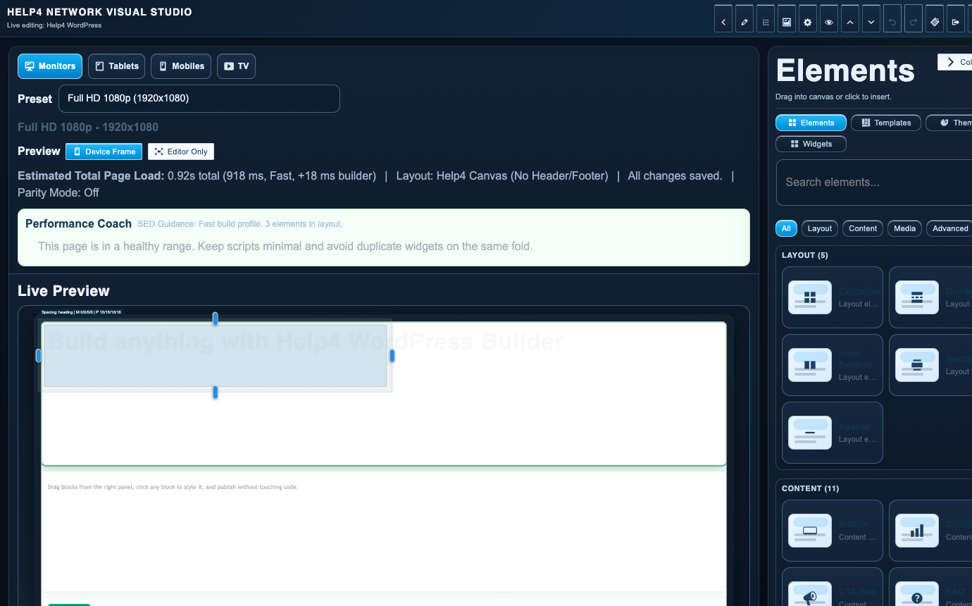
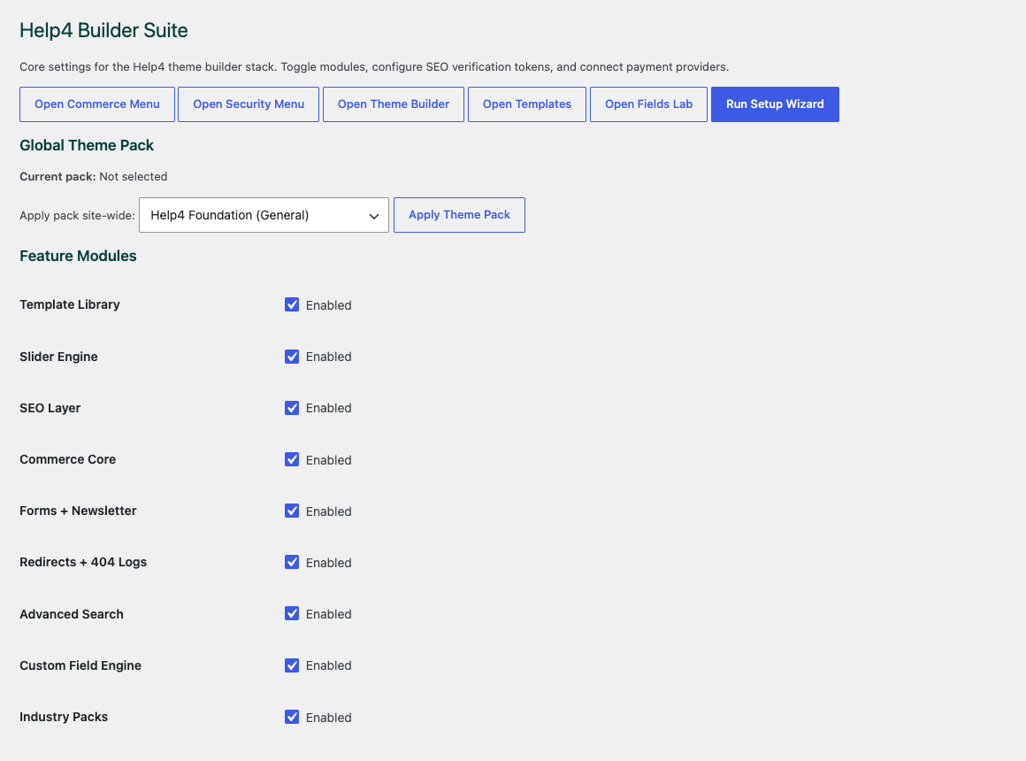
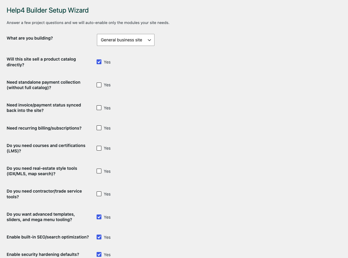
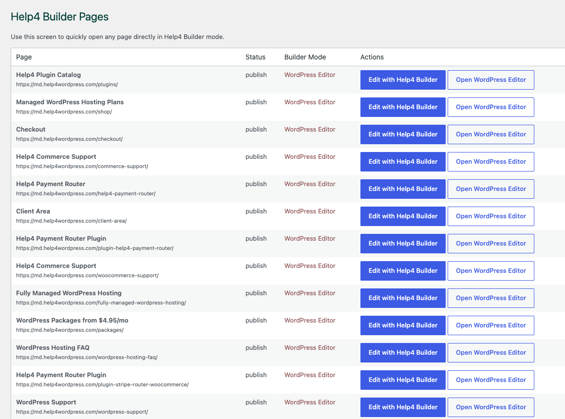
Build media sections without turning the whole site heavy.
Start from the Builder Suite setup path, then add screenshots, galleries, sliders, and motion only where the page needs them.
Open Builder TutorialsPlan media like proof, not decoration.
Media sections should help a visitor understand the product, service, tutorial, or result faster. Use screenshots when the customer needs to see the workflow, galleries when comparison matters, sliders when there is a real sequence, and motion only when it supports the message. Builder Suite keeps those visual choices inside module-aware controls so a simple support page does not load the same assets as a heavy landing page. The best media block answers a question: what does this look like, what changed, what can the buyer trust, and what should they do next?
- Use screenshots for proof, setup steps, and recent work references.
- Use galleries for comparisons, before-and-after sets, and product context.
- Use sliders only when sequence or rotation improves the page.
- Check mobile cropping, load behavior, alt text, and support handoff before launch.
Turn the visual idea into a page plan.
Pick the smallest visual pattern that proves the point, write a caption that explains why it matters, then test the page on mobile before publishing.
Open Builder TutorialsImages, sliders, galleries, and motion
Build visual WordPress sections that remain fast and understandable
Media should explain the product, service, place, or result instead of acting as decoration. Help4 Builder supports images, galleries, video, sliders, icons, quotes, calls to action, and controlled motion so visual pages can carry real information without becoming difficult to scan.
Use the right source dimensions, meaningful alternative text, modern image formats, and restrained movement. Check cropping at every breakpoint and avoid autoplay behavior that competes with forms or primary calls to action. The same assets can be saved inside templates when the pattern needs to repeat.
- Use descriptive media and captions when a visitor needs context or proof.
- Keep motion optional, short, and compatible with reduced-motion preferences.
- Confirm that mobile crops preserve the subject and do not create horizontal overflow.